6 Introduction to SAS
6.1 Introduction
SAS (Statistical Analysis System) is a software that was originally created in the 1960s. Today, it is widely used by statisticians working in biostatistics and the pharmaceutical industries. Unlike Python and R, it is a proprietary software. The full license is quite expensive for a low-usage case such as ours. Thankfully, there is a free web-based version that we can use for our course.
6.2 Registering for a SAS Studio Account
The first step is to create a SAS profile: Use your NUS email address to register and create your SAS profile using this link.
Once you have verified your account using the email that would be sent to you, the following link should take you to the login page shown in Figure 6.1.
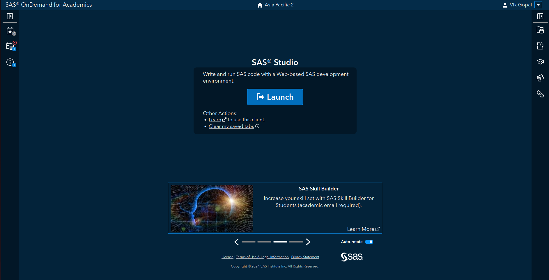
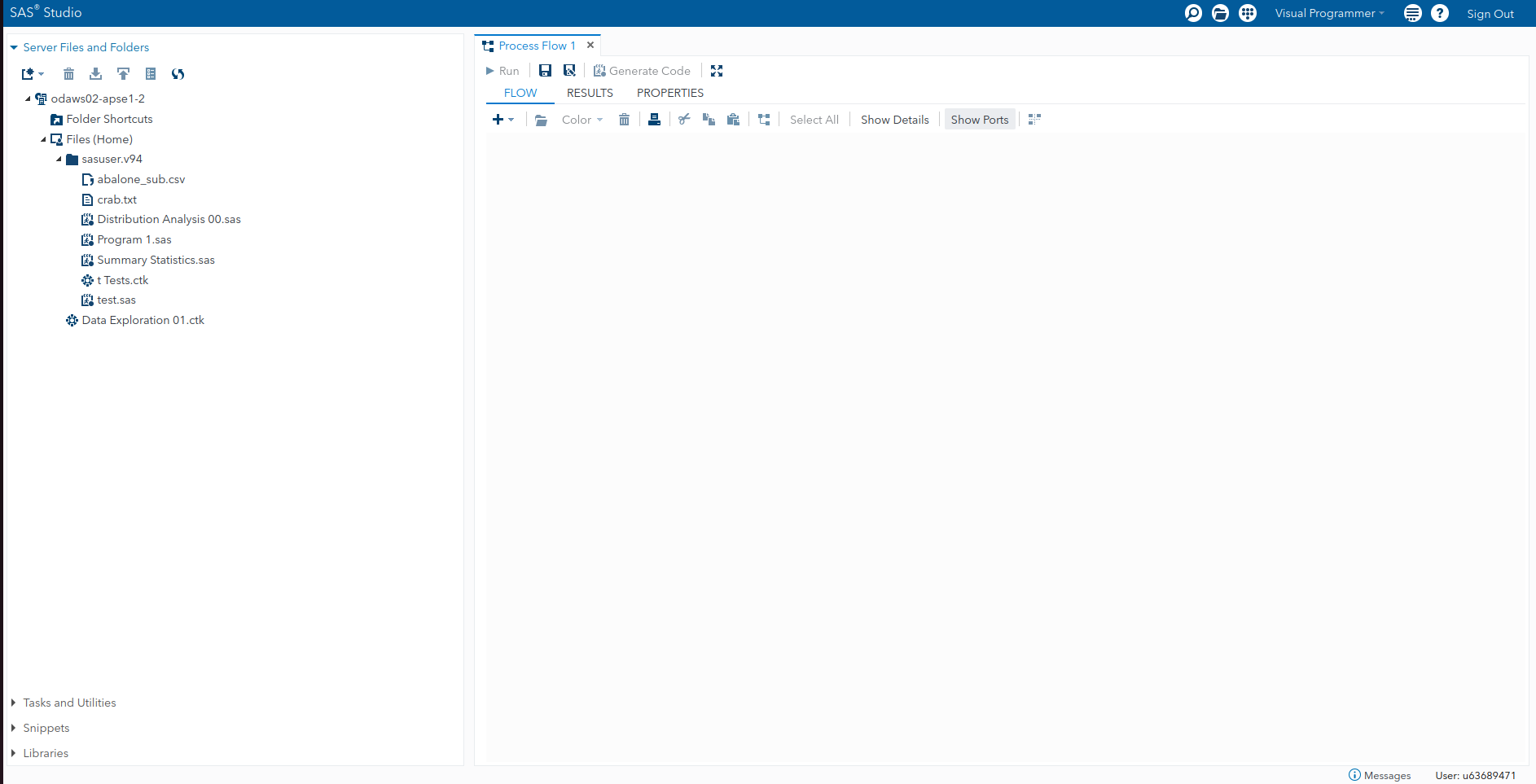
Subsequently logging in should take you to the landing page, where you can begin writing SAS code and using SAS. This interface can be seen in Figure 6.2.
6.3 An Overview of SAS Language
The SAS language is not a fully-fledged programming language like Python is, or even R. For the most part, we are going to capitalise on the point-and-click interface of SAS Studio in our course. However, even so, it is good to understand a little about the language so that we can modify the options for different procedures as necessary.
A SAS program is a sequence of statements executed in order. Keep in mind that:
Every SAS statement ends with a semicolon.
SAS programs are constructed from two basic building blocks: DATA steps and PROC steps. A typical program starts with a DATA step to create a SAS data set and then passes the data to a PROC step for processing.
Example 6.1 (Creating and Printing a Dataset) Here is a simple program that converts miles to kilometres in a DATA step and then prints the results with a PROC step:
To run the above program, click on the “Running Man” icon in SAS studio. You should obtain the output shown in Figure 6.3.
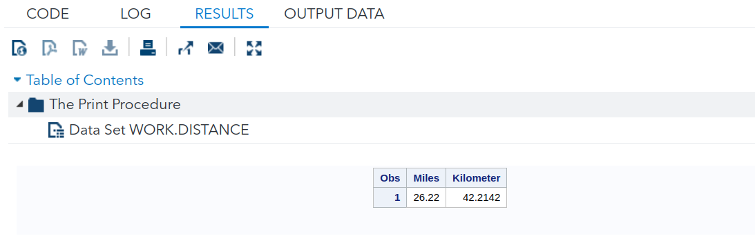
This dataset has only one observation (row).
Data steps start with the DATA keyword. This is followed by the name for the dataset. Procedures start with PROC followed by the name of the particular procedure (e.g. PRINT, SORT or PLOT) you wish to run on the dataset. Most SAS procedures have only a handful of possible statements. A step ends when SAS encounters a new step (marked by a DATA or PROC statement) or a RUN statement. RUN statements are not part of a DATA or PROC step; they are global statements.
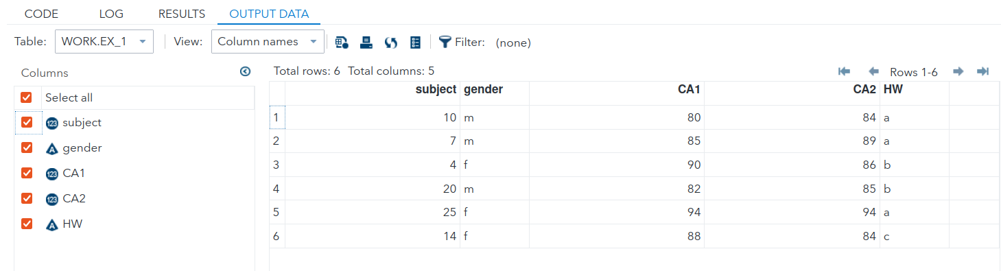
Example 6.2 (Creating a Dataset Inline) The following program explicitly creates a dataset within the DATA step.
The output for the above code is shown in Figure 6.4 and Figure 6.5.
In the statements above, the $’s in the INPUT statement inform SAS that the preceding variables (gender and HW) are character. Note how the semi-colon for the DATALINES appears after all the data has been listed.
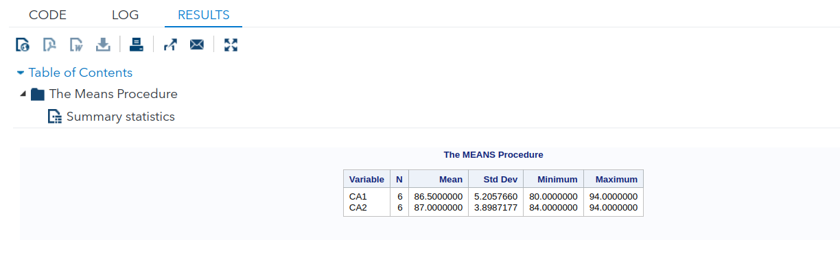
PROC MEANS creates basic summary statistics for the variables listed.
To review, there are only 2 types of steps in SAS programs:
DATA steps
- begin with DATA statements.
- read and modify data.
- create a SAS dataset.
PROC steps
- begin with PROC statements.
- perform specific analysis or function.
- produce reports or results.
6.4 Basic Rules for SAS Programs
For SAS statements
- All SAS statements (except those containing data) must end with a semicolon (;).
- SAS statements typically begin with a SAS keyword. (DATA, PROC).
- SAS statements are not case sensitive, that is, they can be entered in lowercase, uppercase, or a mixture of the two.
- Example : SAS keywords (DATA, PROC) are not case sensitive
- A delimited comment begins with a forward slash-asterisk (/) and ends with an asterisk-forward slash (/). All text within the delimiters is ignored by SAS.
For SAS names
- All names must contain between 1 and 32 characters.
- The first character appearing in a name must be a letter (A, B, … Z, a, b, …, z) or an underscore ( ). Subsequent characters must be letters, numbers, or underscores. That is, no other characters, such as $, %, or & are permitted.
- Blanks also cannot appear in SAS names.
- SAS names are not case sensitive, that is, they can be entered in lowercase, uppercase, or a mixture of the two. (SAS is only case sensitive within quotation marks.)
For SAS variables
- If the variable in the INPUT statement is followed by a dollar sign ($), SAS assumes this is a character variable. Otherwise, the variable is considered as a numeric variable.
6.5 Reading Data into SAS
In this topic, we shall introduce a new dataset, also from the UCI Machine Learning repository.
Example 6.3 (Bike Rentals)
The dataset was collected by the authors in Fanaee-T and Gama (2013). It contains information on bike-sharing rentals in Washington D.C. USA for the years 2011 and 2012, along with measurements of weather. The original dataset contained hourly and daily aggregated data. For our class, we use a re-coded version of the daily data. Our dataset can be found on Canvas as bike2.csv.
Here is the data dictionary:
| Field | Description |
|---|---|
| instant | Record index |
| dteday | Date |
| season | spring, summer, fall, winter |
| yr | Year (0: 2011, 1: 2012) |
| mnth | Abbreviated month |
| holiday | Whether the day is a holiday or not |
| weekday | Abbreviated day of the week |
| workingday | yes: If day is neither weekend nor holiday is 1, no: Otherwise |
| weathersit | Weather situation: clear: Clear, Few clouds, Partly cloudy, Partly cloudy; mist: Mist + Cloudy, Mist + Broken clouds, Mist + Few clouds, Mist; light_precip: Light Snow, Light Rain + Thunderstorm + Scattered clouds, Light Rain + Scattered clouds; heavy_precip: Heavy Rain + Ice Pallets + Thunderstorm + Mist, Snow + Fog |
| temp | Normalized temperature in Celsius. Divided by 41 (max) |
| atemp | Normalized perceived temperature in Celsius. Divided by 50 (max) |
| hum | Normalized humidity. Divided by 100 (max) |
| windspeed | Normalized wind speed. Divided by 67 (max) |
| casual | Count of casual rental bike users |
| registered | Count of registered rental bike users |
| cnt | Count of total rental bikes including both casual and registered |
Our first step will be to load the dataset into SAS Studio.
6.6 Uploading and Using Datasets
To use our own datasets on SAS Studio, we have to execute the following steps:
- Create a new library. In SAS, a library is a collection of datasets. If you already have a library created, you can simply import datasets into it. The default library on SAS is called
WORK. However, the datasets inWORKwill be purged every time you sign out. Hence it is better to create a new, dedicated library for this course. - Import your dataset (csv, xlsx, etc.) into the library.
- After this, the data will be available for use with the reference name
<library-name>.<dataset-name>.
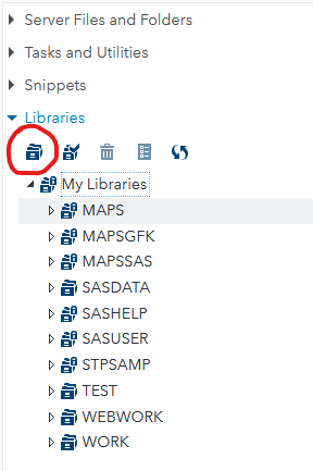
From the “Libraries” menu on the left of SAS studio, click on the “New library” icon (the one circled in red in Figure 6.6), and create a new library called “ST2137”. You can use the default suggested path for the library.
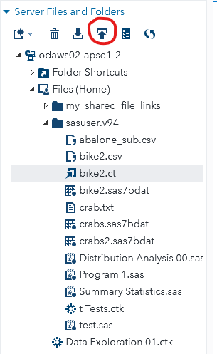
Now expand the menu for “Server Files and Folders” and upload bike2.csv file to SAS, using the circled icon in Figure 6.7.
Finally, right-click on the top of the main Studio area (where we write code) and select “New Import Data”. Select the bike2.csv that has just been uploaded, and modify the OUTPUT DATA settings to Library ST2137 and Data set name BIKE2. Click on the running man, and your dataset is now ready for use in SAS studio!
6.7 Summarising Numerical Data
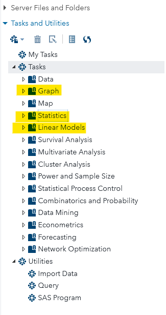
Most of the SAS routines we are going to work with can be found in the “Tasks and Utilities” section (see highlighted tasks in Figure 6.8).
Numerical Summaries
Example 6.4 (5-number Summaries)
We expect that the total count of users will vary by the seasons. Hence, we begin by computing five-number summaries for each season.
Under Tasks, go to Statistcs > Summary Statistics. Select cnt as the analysis variable, and season as the classification variable. Under the options tab, select the lower and upper quartiles, along with comparative boxplots. The output should look like Figure 6.9:
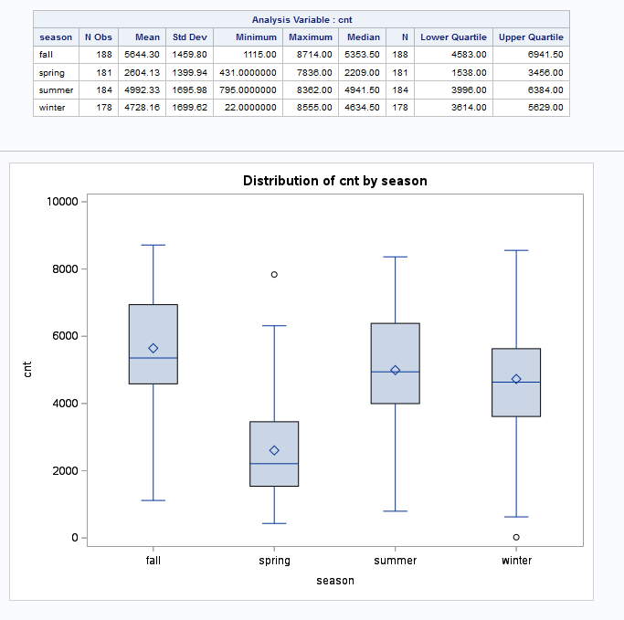
We observe that the median count is highest for fall, followed by summer, winter and lastly spring. The spreads, as measured by IQR, are similar across the seasons: approximately 2000 users. In the middle 50%, the count distribution for spring is the most right-skewed.
Scatter Plots
Example 6.5 (Casual vs Registered Scatterplot)
To create a scatterplot in SAS, go to Tasks > Graphs > Scatter Plot.
Specify casual on the x-axis, registered on the y-axis, and workingday as the Group. You should observe the plot created Figure 6.10:
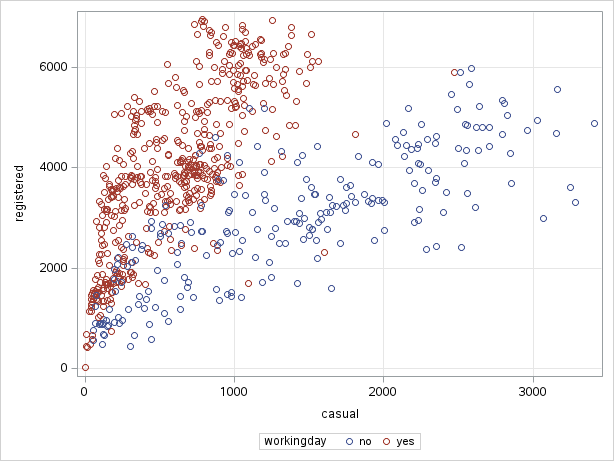
We can see that there seem to be two different relationships between the counts of casual and registered users. The two relationships correspond to whether it as a working day or not.
Histograms
Example 6.6 (Casual Users Distribution)
Now suppose we focus on casual users, and study the distribution of counts by whether a day is a working day or not. To create a histogram, go to Tasks > Graph > Histogram. Select casual as the analysis variable, and workingday as the group variable.
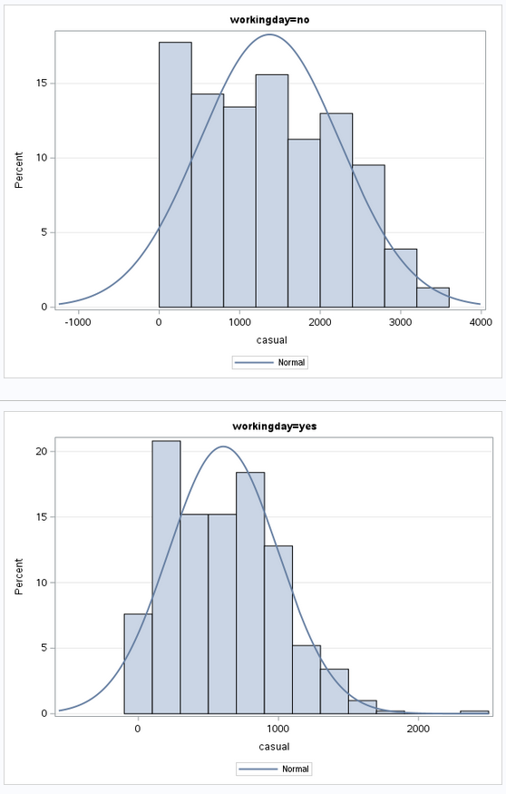
From Figure 6.11, we can see that the distribution is right-skewed in both cases. However, the range of counts for non-working days extends further, to about 3500.
Boxplots
Example 6.7 (Boxplots for Casual Users, by Season) In Example 6.4, we observed that total counts vary by season, and in Example 6.6, we observed that working days seem to have fewer casual users. Let us investigate if this difference is related to season.
To create boxplots, go to Tasks > Box Plot. Select casual as the analysis variable, season as the category and workingday as the subcategory. You should obtain the plot in Figure 6.12.
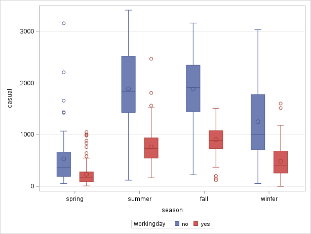
To order the seasons according to the calendar, I had to add this line to the code:
There is little further insight compared to the previous two examples. However, now try the same plots, but on the log scale (modify the APPEARANCE tab and re-run). You should now obtain Figure 6.13.
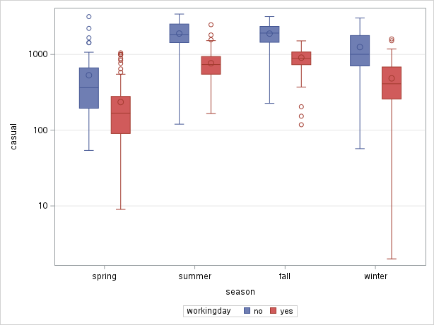
Now, we can observe that the difference within each season is constant across seasons. Because the difference in logarithms is constant, it means that, on the original scale, it is a constant multiplicative factor that increases counts from workingday to non-working day.
We have arrived at a more succint representation of the relationship by using the log transform.
QQ-plots
Example 6.8 (Normality Check for Humidity) To create QQ-plots, we go to Tasks > Statistics > Distribution Analysis.
Select hum for the analysis variable. Under options, add the normal curve, the kernel density estimate, and the Normal quantile-quantile plot. You should obtain the following two charts:
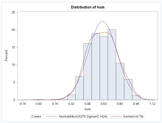
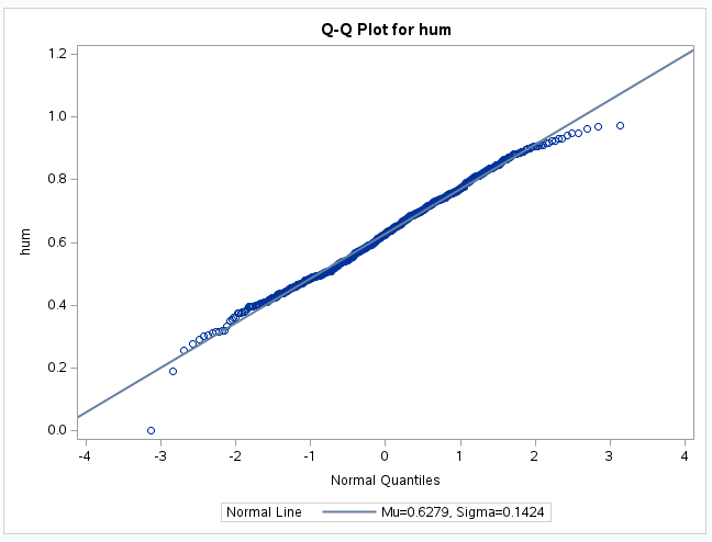
The plot shows that humidity values are quite close to a Normal distribution, apart from a single observation on the left.
6.8 Categorical Data
We now turn to categorical data methods with SAS. We return to the dataset on student performance that we used in the topic on summarising data. Upload and store student-mat.csv as ST2137.STUD_PERF on the SAS Studio website.
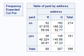
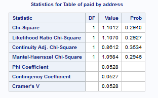
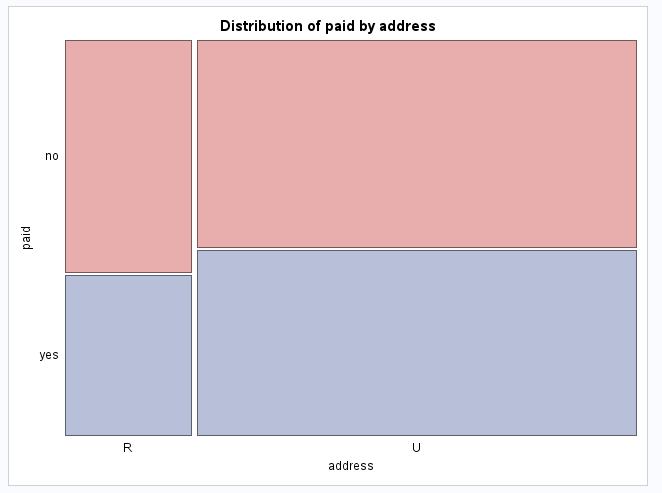
Example 6.9 (\(\chi^2\) Test for Independence)
For a test of independence of address and paid, go to Tasks > Table Analysis, and select:
addressas the column variablepaidas the row variable.- Under OPTIONS, check the “Chi-square statistics” box.
The output in Figure 6.14 and Figure 6.15 should enable you to perform the test.
For measures of association, we only need to select the option for “Measures of Association” to generate the Kendall \(\tau_b\) that we covered earlier in Chapter 4.
Example 6.10 (Kendall \(\tau\) for Walc and Dalc)
Once we load the data ST2137.STUD_PERF, we go to Tasks > Table Analysis. After selecting the two variables, we check the appropriate box to obtain Figure 6.17.
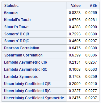
You may observe that the particular associations computed and returned are similar to those by the Desc R package that we used in Example 4.10.
6.9 References
6.10 Website References
- SAS account sign-up Use this link to sign up for a SAS account.
- SAS Studio link Once you have activated your account, use this link to login to your SAS studio online.
- SAS Studio Help This link contains help on SAS studio features and commands.