| Patient | Gender | Pain |
|---|---|---|
| 1 | female | no pain |
| 2 | male | no pain |
| 3 | female | no pain |
| 4 | male | no pain |
| 5 | female | no pain |
| 6 | male | pain |
4 Exploring Categorical Data
4.1 Introduction
A variable is known as a categorical variable if each observation belongs to one of a set of categories. Examples of categorical variables are: gender, religion, race and type of residence.
Categorical variables are typically modeled using discrete random variables, which are strictly defined in terms whether or not the support is countable. The alternative to categorical variables are quantitative variables, which were introduced in the previous chapter.
Another method for distinguishing between quantitative and categorical variables is to ask if there is a meaningful distance between any two points in the data. If such a distance is meaningful then we have quantitative data. For instance, it makes sense to compute the difference in systolic blood pressure between subjects, but it does not make sense to consider the mathematical operation (“smoker” - “non-smoker”).
It is important to identify which type of data we have (quantitative or categorical), since it affects the exploration techniques that we can apply.
There are two sub-types of categorical variables:
- A categorical variable is ordinal if the observations can be ordered, but do not have specific quantitative values.
- A categorical variable is nominal if the observations can be classified into categories, but the categories have no specific ordering.
In this chapter, we shall discuss techniques for identifying the presence, and for measuring the strength, of the association between two categorical variables. We shall also demonstrate common visualisations used with categorical data.
4.2 Contingency Tables
Example 4.1 (Chest Pain and Gender)
Suppose that 1073 NUH patients who were at high risk for cardiovascular disease (CVD) were randomly sampled. They were then queried on two things:
- Had they experienced the onset of severe chest pain in the preceding 6 months? (yes/no)
- What was their gender? (male/female)
The data would probably have been recorded in the following format (only first few rows shown):
However, it would probably be summarised and presented in this format, which is known as a contingency table.
| pain | no pain | |
|---|---|---|
| male | 46 | 474 |
| female | 37 | 516 |
In a contingency table, each observation from the dataset falls in exactly one of the cells. The sum of all entries in the cells equals the number of independent observations in the dataset.
All the techniques we shall touch upon in this chapter are applicable to contingency tables.
4.3 Visualisations
Bar charts
A common method for visualising cross combinations of categorical data is to use a bar chart.
Example 4.2 (Political Association and Gender Barchart)
Consider data given in the table below where both variables are nominal. It cross-classifies poll respondents according to their gender and their political party affiliation.
| Dem | Ind | Rep | |
|---|---|---|---|
| female | 762 | 327 | 468 |
| male | 484 | 239 | 477 |
Here is R code to make a barchart for this data.
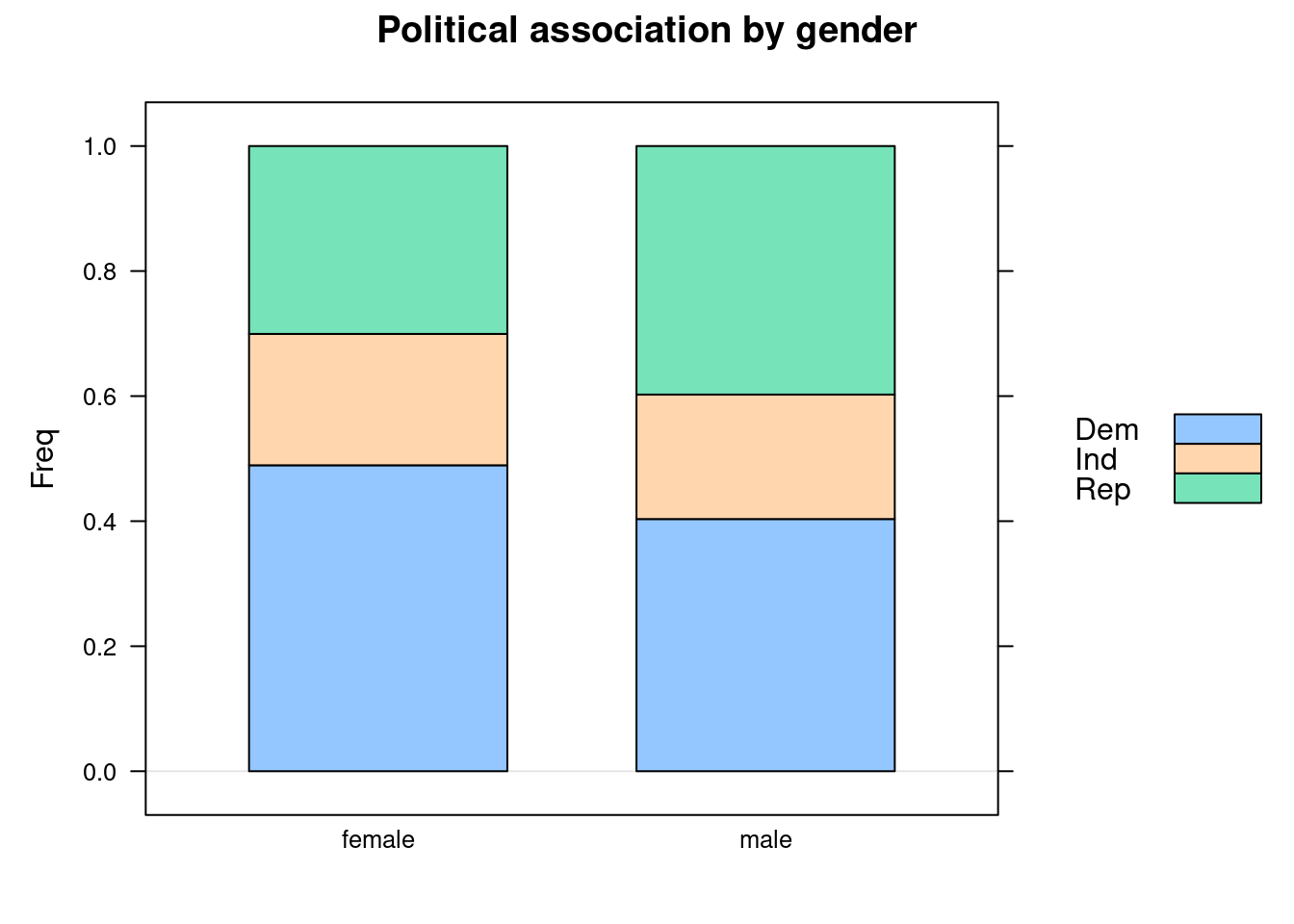
We can see that the proportion of Republicans is higher for males than for females. The corresponding proportion of Democrats is lower. However, note that the barchart does not reflect that the marginal count for males was much less than that for females.
Let us turn to making bar charts with pandas and Python.
Example 4.3 (Claritin and Nervousness Barchart)
Claritin is a drug for treating allergies. However, it has a side effect of inducing nervousness in patients. From a sample of 450 subjects, 188 of them were randomly assigned to take Claritin, and the remaining were assigned to take the placebo. The observed data was as follows:
| nervous | not nervous | |
|---|---|---|
| claritin | 4 | 184 |
| placebo | 2 | 260 |
A barchart can be created in Python with the following code. This barchart is slightly different from the one in Example 4.2 because it is not stacked.
import numpy as np
import pandas as pd

claritin_tab = np.array([[4, 184], [2, 260]])
claritin_prop = claritin_tab/claritin_tab.sum(axis=1).reshape((2,1))

xx = pd.DataFrame(claritin_prop,
                  columns=['nervous', 'not_nervous'],
                  index=['claritin', 'placebo'])

ax = xx.plot(kind='bar', stacked=False, rot=1.0, figsize=(10,4),
             title='Nervousness by drug')
ax.legend(loc='upper left');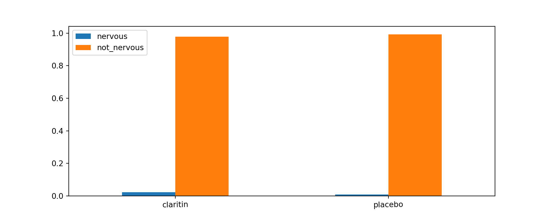
The proportion of patients who are not nervous is similar in both groups.
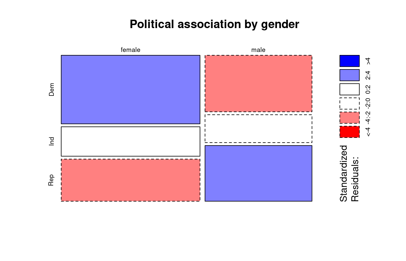
Mosaic plots
Unlike a bar chart, a mosaic plot reflects the count in each cell (through the area), along with the proportions of interest. Let us inspect how we can make mosaic plots for the political association data earlier.
Example 4.4 (Political Association and Gender Mosaic Plot)
The colours in Figure 4.2 reflect the sizes of the standardised residuals. We shall discuss this in more detail in Section 4.4.3.
The greater width of the tiles in the column for females reflects the larger marginal count for females. Compare this visualisation with Figure 4.1.

Conditional Density Plots
When we have one categorical and one quantitative variable, the kind of plot we make really depends on which is the response, and which is the explanatory variable. If the response variable is the quantitative one, it makes sense to create boxplots or histograms. However, if the response variable is a the categorical one, we should really be making something along these lines:
Example 4.5 (Heart Failure Dataset)
The dataset at UCI repository contains records on 299 patients who had heart failure. The data was collected during the follow-up period; each patient had 13 clinical features recorded. The primary variable of interest was whether they died or not. Suppose we wished to plot how this varied with age (a quantitative variable):
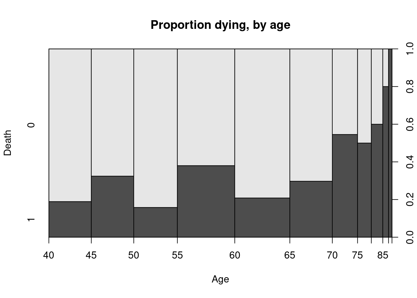
It reflects how the probability of an event varies with the quantitative explanatory variable. A smoothed version of this is known as the conditional density plot:
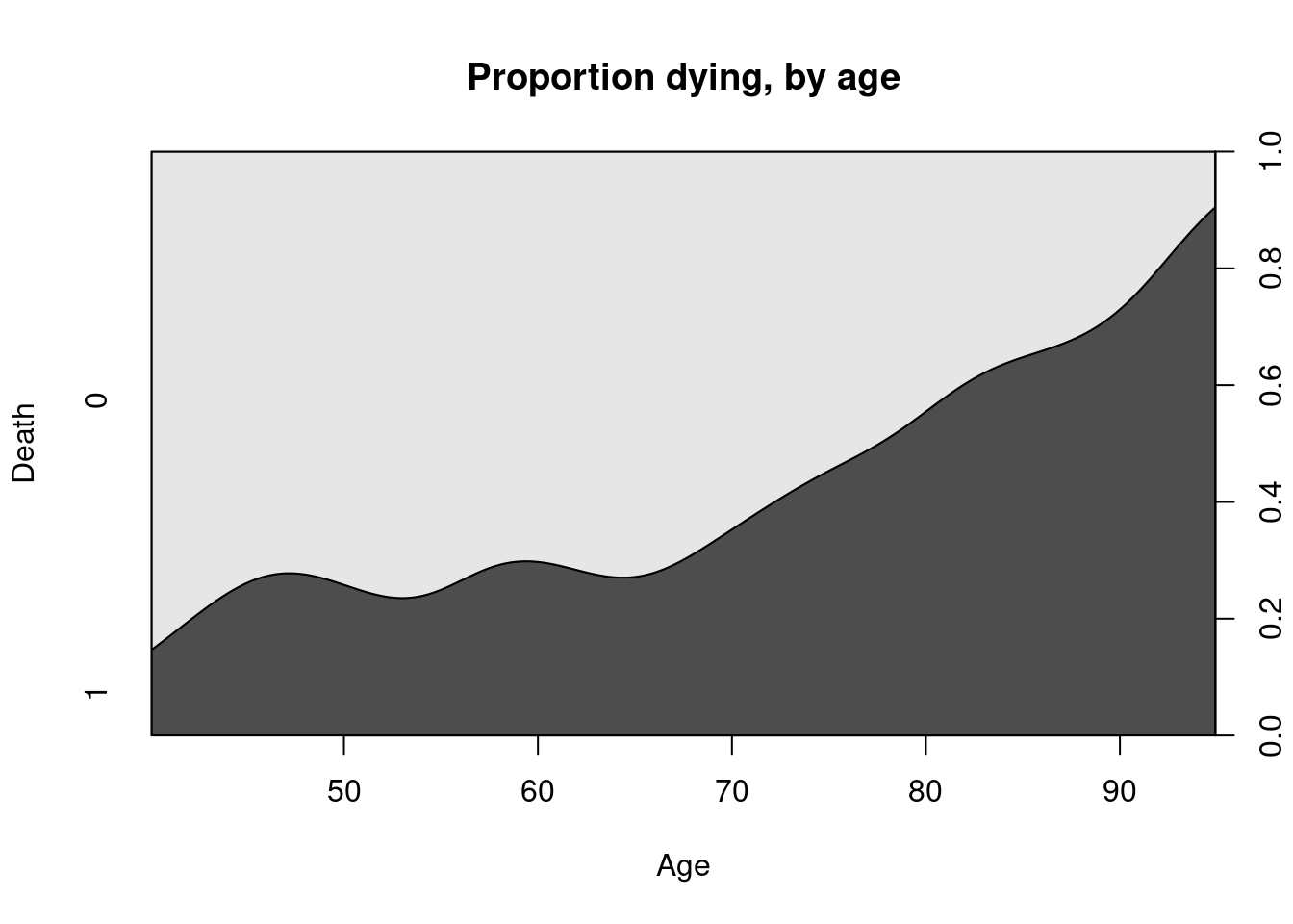
From both Figure 4.3 and Figure 4.4, it is clear to see that there is an increased proportion of death during follow-up associated with older patients.
4.4 Tests for Independence
In the contingency table above, the two categorical variables are Gender and Presence/Absence of Pain. With contingency tables, the main inferential task usually relates to assessing the association between the two categorical variables.
NoteIndependent Categorical Variables
If two categorical variables are independent, then the joint distribution of the variables would be equal to the product of the marginals. If two variables are not independent, we say that they are associated.
In the remainder of this section, we are going to discuss and apply statistical hypothesis tests. Refer to Section 7.2 for a quick recap about hypothesis testing.
\(\chi^2\)-Test for Independence
The \(\chi^2\)-test uses the definition above to assess if two variables in a contingency table are associated. The null and alternative hypotheses are
\[\begin{eqnarray*} H_0 &:& \text{The two variables are indepdendent.} \\ H_1 &:& \text{The two variables are not indepdendent.} \end{eqnarray*}\]
Under the null hypothesis, we can estimate the joint distribution from the observed marginal counts. Based on this estimated joint distribution, we then compute expected counts (which may not be integers) for each cell. The test statistic essentially compares the deviation of observed cell counts from the expected cell counts.
Example 4.6 (Chest Pain and Gender Expected Counts)
Continuing from Example 4.1, we can compute the estimated marginals using row and column proportions
──────────────────────────────────────────────────────────────────────────────
chest_tab (table)

Summary:
n: 1'073, rows: 2, columns: 2

Pearson's Chi-squared test (cont. adj):
  X-squared = 1.4555, df = 1, p-value = 0.2276
Fisher's exact test p-value = 0.2089


                 pain   no pain   Sum

male     freq      46       474   520
         p.row   8.8%     91.2%     .
         p.col  55.4%     47.9% 48.5%

female   freq      37       516   553
         p.row   6.7%     93.3%     .
         p.col  44.6%     52.1% 51.5%

Sum      freq      83       990 1'073
         p.row   7.7%     92.3%     .
         p.col      .         .     .


────────────────────
' 95% conf. level
In the output above, ignore the \(p\)-values for now.. We’ll get to those in a minute. Let \(X\) represent gender and \(Y\) represent chest pain. Then from the estimated proportions in the “Sum” row and colums, we can read off the following estimated probabilities
\[\begin{eqnarray*} \widehat{P}(X = \text{male}) &=& 0.485 \\ \widehat{P}(Y = \text{pain}) &=& 0.077 \end{eqnarray*}\]
Consequently, under \(H_0\), we would estimate \[ \widehat{P}(X = \text{male},\, Y= \text{pain}) = 0.485 \times 0.077 \approx 0.04 \]
From a sample of size 1073, the expected count for this cell is then
\[ 0.04 \times 1073 = 42.92 \]
Using the approach above, we can derive a general formula for the expected count in each cell: \[ \text{Expected count} = \frac{\text{Row total} \times \text{Column total}}{\text{Total sample size}} \]
The formula for the \(\chi^2\)-test statistic (with continuity correction) is: \[ \chi^2 = \sum \frac{(|\text{expected} - \text{observed} | - 0.50 )^2}{\text{expected count}} \tag{4.1}\]
The sum is taken over every cell in the table. Hence in a \(2\times2\) table, as in Example 4.1, there would be 4 terms in the summation.
Example 4.7 (Chest Pain and Gender \(\chi^2\) Test)
Let us see how we can apply and interpret the \(\chi^2\)-test for the data in Example 4.1.
    Pearson's Chi-squared test with Yates' continuity correction

data:  chest_tab
X-squared = 1.4555, df = 1, p-value = 0.2276
from scipy import stats
chest_array = np.array([[46, 474], [37, 516]])
chisq_output = stats.chi2_contingency(chest_array)
print(f"The p-value is {chisq_output.pvalue:.3f}.")
## The p-value is 0.228.
print(f"The test-statistic value is {chisq_output.statistic:.3f}.")
## The test-statistic value is 1.456.Since the \(p\)-value is 0.2276, we would not reject the null hypothesis at significance level 5%. We do not have sufficient evidence to conclude that the variables are not independent.
To extract the expected cell counts, we can use the following code:
The test statistic compares the above table to the observed table, earlier in Example 4.1.
Important
It is only suitable to use the \(\chi^2\)-test when all expected cell counts are larger than 5.
Fisher’s Exact Test
When the condition above is not met, we turn to Fisher’s Exact Test. The null and alternative hypothesis are the same, but the test statistic is not derived in the same way.
If the marginal totals are fixed, and the two variables are independent, it can be shown that the individual cell counts arise from the hypergeometric distribution, which is defined as follows:
Suppose we have an urn with \(m\) black balls and \(n\) red balls. From this urn, we draw a random sample (without replacement) of size \(k\). If we let \(W\) be the number of red balls drawn, then \(W\) follows a hypergeometric distribution. The pmf is:
\[ P(W=w) = \frac{\binom{n}{w} \binom{m}{k-w}}{\binom{n+m}{k}} \]
Note
What is the support of \(W\)?
To transfer this to the context of \(2 \times 2\) tables, suppose we have fix the marginal counts of the table, and consider the count in the top-left corner to be a random variable following a hypergeometric distribution, with \(r_{1\cdot}\) red balls and \(r_{2 \cdot}\) black balls. Consider drawing a sample of size \(c_{1 \cdot}\) from these \(r_{1\cdot} + r_{2 \cdot}\) balls.
| \(W\) | - | \(r_{1 \cdot}\) (red balls) |
| - | - | \(r_{2\cdot}\) (black balls) |
| \(c_{1 \cdot}\) (sample size drawn) | \(c_{2\cdot}\) |
Note that, assuming the marginal counts are fixed, knowledge of one of the four entries in the table is sufficient to compute all the counts in the table.
For the purpose of calculating \(p\)-values, a table is considered ‘more extreme’ than the one observed, if its probability is less than or equal to that of the observed table. The \(p\)-value is the sum of all such probabilities.
In practice, instead of summing over all values, the \(p\)-value is obtained by simulating tables with the same marginals as the observed dataset, and estimating the above probability.
Using Fisher’s test sidesteps the need for a large sample size (which is required for the \(\chi^2\) approximation to hold); hence the “Exact” in the name of the test.
Example 4.8 (Claritin and Nervousness)
Here is the code to perform the Fisher Exact Test for the Claritin data.
    Fisher's Exact Test for Count Data

data:  claritin_tab
p-value = 0.2412
alternative hypothesis: true odds ratio is not equal to 1
95 percent confidence interval:
  0.399349 31.473382
sample estimates:
odds ratio
2.819568 As the \(p\)-value is 0.2412, we again do not have sufficient evidence to reject the null hypothesis and conclude that there is a significant association.
By the way, we can check (in R) to see that the \(\chi^2\)-test would not have been appropriate:
\(\chi^2\)-Test for \(r \times c\) Tables
Thus far, we have considered the situation concerning categorical variables where each has only two possible outcomes (2x2 table). However, it is common to want to check the association between two nominal variables where one of them, or both, has more than 2 outcomes.
Example 4.9 (Political Association and Gender)
Let us return to the political association data, which we plotted in Example 4.2. The R code for applying the test is identical to before
    Pearson's Chi-squared test

data:  political_tab
X-squared = 30.07, df = 2, p-value = 2.954e-07
In this case, there is strong evidence to reject \(H_0\). At 5% level, we would reject the null hypothesis and conclude there is an association between gender and political affiliation.
In general, we might have \(r\) rows and \(c\) columns. The null and alternative hypotheses are identical to the 2x2 case, and the test statistic is computed in the same way. However, under the null hypothesis, the test statistic follows a \(\chi^2\) distribution with \((r-1)(c-1)\) degrees of freedom.
The \(\chi^2\)-test is based on a model of independence - the expected counts are derived under this assumption. As such, it is possible to derive residuals and study them, to see where the data deviates from this model.
We define the standardised residuals to be
\[ r_{ij} = \frac{n_{ij} - \mu_{ij}}{\sqrt{\mu_{ij} (1 - p_{i+})(1 -p_{+j} )}} \] where
- \(n_{ij}\) is the observed cell count in row \(i\) and column \(j\) (cell \(ij\)).
- \(\mu_{ij}\) is the expected cell count in row \(i\) and column \(j\)
- \(p_{i+}\) is the marginal probability of row \(i\)
- \(p_{+j}\) is the marginal probability of column \(j\).
The residuals can be obtained from the test output. Under \(H_0\), the residuals should be close to a standard Normal distribution. If the residual for a particular cell is very large (or small), we suspect that lack of fit (to the independence model) arises from that cell.
For the political association table, the standardised residuals (from R) are:
4.5 Measures of Association
This sections covers bivariate measures of association for categorical variables.
Odds Ratio
The most generally applicable measure of association, for 2x2 tables, is the Odds Ratio (OR). Suppose we have \(X\) and \(Y\) to be Bernoulli random variables with (population) success probabilities \(p_1\) and \(p_2\).
We define the odds of success for \(X\) to be \[ \frac{p_1}{1-p_1} \] Similarly, the odds of success for random variable \(Y\) is \(\frac{p_2}{1-p_2}\).
In order to measure the strength of their association, we use the odds ratio: \[ \frac{p_1/ (1-p_1)}{p_2/(1-p_2)} \]
The odds ratio can take on any value from 0 to \(\infty\).
- A value of 1 indicates no association between \(X\) and \(Y\). If \(X\) and \(Y\) were independent, this is precisely what we would observe.
- Deviations from 1 indicate stronger association between the variables.
- Note that, for odds ratios, deviations from 1 are not symmetric. For a given pair of variables, an association of 0.25 or 4 is the same - it is just a matter of which variable we put in the numerator odds.
Due to the above asymmetry, we often use the log-odds-ratio instead: \[ \log \frac{p_1/ (1-p_1)}{p_2/(1-p_2)} \]
- Log-odds-ratios can take values from \(-\infty\) to \(\infty\).
- A value of 0 indicates no association between \(X\) and \(Y\).
- Deviations from 0 indicate stronger association between the variables, and deviations are now symmetric; a log-odds-ratio of -0.2 indicates the same strength as 0.2, just the opposite direction.
To obtain a confidence interval for the odds-ratio, we work with the log-odds ratio and then exponentiate the resulting interval. Here are the steps for a \(2\times 2\) table:
- Suppose we label the observed counts in the table as \(n_{11}, n_{12}, n_{21}, n_{22}\).
- The sample odds ratio is \[ \widehat{OR} = \frac{n_{11} \times n_{22}}{n_{12} \times n_{21}} \]
- For a large sample size, it can be shown that \(\log \widehat{OR}\) follows a Normal distribution. Hence a 95% confidence interval can be obtained through \[ \log \frac{n_{11} \times n_{22}}{n_{12} \times n_{21}} \pm z_{0.025} \times ASE(\log \widehat{OR}) \]
where the ASE (Asymptotic Standard Error) of the estimator is \[ \sqrt{\frac{1}{n_{11}} + \frac{1}{n_{12}} + \frac{1}{n_{21}} + \frac{1}{n_{22}}} \]
Example 4.10 (Chest Pain and Gender Odds Ratio)
Let us compute the confidence interval for the odds ratio in the chest pain and gender example from earlier.
               Estimate   SE   LCB    UCB  p-value
--------------------------------------------------
Odds ratio        1.353        0.863 2.123   0.188
Log odds ratio    0.303 0.230 -0.148 0.753   0.188
Risk ratio        1.322        0.872 2.004   0.188
Log risk ratio    0.279 0.212 -0.137 0.695   0.188
--------------------------------------------------
For Ordinal Variables
When both variables are ordinal, it is often useful to compute the strength (or lack) of any monotone trend association. It allows us to assess if
As the level of \(X\) increases, responses on \(Y\) tend to increase toward higher levels, or responses on \(Y\) tend to decrease towards lower levels.
For instance, perhaps job satisfaction tends to increase as income does. In this section, we shall discuss a measure for ordinal variables, analogous to Pearson’s correlation for quantitative variables, that describes the degree to which the relationship is monotone. It is based on the idea of a concordant or discordant pair of subjects.
Definition 4.1
- A pair of subjects is concordant if the subject ranked higher on \(X\) also ranks higher on \(Y\).
- A pair is discordant if the subject ranking higher on \(X\) ranks lower on \(Y\).
- A pair is tied if the subjects have the same classification on \(X\) and/or \(Y\).
If we let
- \(C\): number of concordant pairs in a dataset, and
- \(D\): number of discordant pairs in a dataset.
Then if \(C\) is much larger than \(D\), we would have reason to believe that there is a strong positive association between the two variables. Here are two measures of association based on \(C\) and \(D\):
- Goodman-Kruskal \(\gamma\) is computed as \[ \gamma = \frac{C - D}{C + D} \]
- Kendall \(\tau_b\) is \[ \tau_b = \frac{C - D}{A} \] where \(A\) is a normalising constant that results in a measure that works better with ties, and is less sensitive than \(\gamma\) to the cut-points defining the categories. However, \(\gamma\) has the advantage that it is more easily interpretable.
For both measures, values close to 0 indicate a very weak trend, while values close to 1 (or -1) indicate a strong positive (negative) association.
Example 4.11 (Job Satisfaction by Income)
Consider the following table, obtained from Agresti (2012). The original data come from a nationwide survey conducted in the US in 1996.
x <- matrix(c(1, 3, 10, 6,
              2, 3, 10, 7,
              1, 6, 14, 12,
              0, 1,  9, 11), ncol=4, byrow=TRUE)
dimnames(x) <- list(c("<15,000", "15,000-25,000", "25,000-40,000", ">40,000"),
                    c("Very Dissat.", "Little Dissat.", "Mod. Sat.",
                      "Very Sat."))
us_svy_tab <- as.table(x)

output <- Desc(x, plotit = FALSE, verbose = 3)
output[[1]]$assocs
estimate lwr.ci upr.ci
Contingency Coeff. 0.2419 - -
Cramer V 0.1439 0.0000 0.1693
Kendall Tau-b 0.1524 -0.0083 0.3130
Goodman Kruskal Gamma 0.2211 -0.0085 0.4507
Stuart Tau-c 0.1395 -0.0082 0.2871
Somers D C|R 0.1417 -0.0080 0.2915
Somers D R|C 0.1638 -0.0116 0.3392
Pearson Correlation 0.1772 -0.0241 0.3647
Spearman Correlation 0.1769 -0.0245 0.3645
Lambda C|R 0.0377 0.0000 0.2000
Lambda R|C 0.0159 0.0000 0.0693
Lambda sym 0.0259 0.0000 0.1056
Uncertainty Coeff. C|R 0.0311 -0.0076 0.0699
Uncertainty Coeff. R|C 0.0258 -0.0069 0.0585
Uncertainty Coeff. sym 0.0282 -0.0072 0.0637
Mutual Information 0.0508 - -from scipy import stats
us_svy_tab = np.array([[1, 3, 10, 6],
[2, 3, 10, 7],
[1, 6, 14, 12],
[0, 1, 9, 11]])
dim1 = us_svy_tab.shape
x = []; y=[]
for i in range(0, dim1[0]):
for j in range(0, dim1[1]):
for k in range(0, us_svy_tab[i,j]):
x.append(i)
y.append(j)
kt_output = stats.kendalltau(x, y)
print(f"The estimate of tau-b is {kt_output.statistic:.4f}.")The estimate of tau-b is 0.1524.The output shows that both \(\gamma = 0.22\) and \(\tau_b =0.15\) are close to significant. The lower confidence limit is close to being positive.
4.6 Further readings
In general, I have found that R packages seem to have a lot more measures of association for categorical variables. In Python, the measures are spread out across packages.
Above, we have only scratched the surface of what is available. If you are keen, do read up on
- Somer’s D (for association between nominal and ordinal)
- Mutual Information (for association between all types of pairs of categorical variables)
- Polychoric correlation (for association between two ordinal variables)
Also, take note of how log odds ratios, \(\tau_b\) and \(\gamma\) work. Firstly, values close to 0 reflect weak association. Values of \(a\) and \(-a\) indicate the same strength, but different direction of association. This allows the same intuition that Pearson’s correlation does. When you are presented with new metrics, try to understand them by asking similar questions about them.
4.7 References
Website References
- Documentation pages from statsmodels:
- Documentation pages from scipy:
- Heart failure data
- More information on Kendall \(\tau_b\) statistic
- The \(\chi^2\) test we studied is a test of independence. It is a variant of the \(\chi^2\) goodness-of-fit test, which is used to assess if data come from a particular distribution. In our case, the presumed distribution is one where the variables are independent. Read more about the goodness-of-fit test here.
4.8 Exercises
- Use Python to create the spineplot for the heart failure data.
- Write a function in Python that converts a contingency table into “long” format.
- What is the interpretation of \(\gamma\) implied by the text?
- From the political association data, extract the standardised residuals (under independence), and create a QQ-plot.
- Apply the Fisher Exact test to the political association data. How does it work in this case?