   Min. 1st Qu.  Median    Mean 3rd Qu.    Max.
0.00 8.00 11.00 10.42 14.00 20.00 [1] 0This is the first topic where we are going to see how to perform statistical analysis using two software: R and Python. Every language has its strengths and weaknesses, so instead of attempting to exactly replicate the same chart/output in each software, we shall try to understand their respective approaches better.
Our end goal is to analyse data. Toward that end, we should be versatile and adaptable. Focus on learning how to be fast and productive in whichever environment you are told to work in. If you have a choice, then be aware of what each framework can do best, so that you can choose the right one.
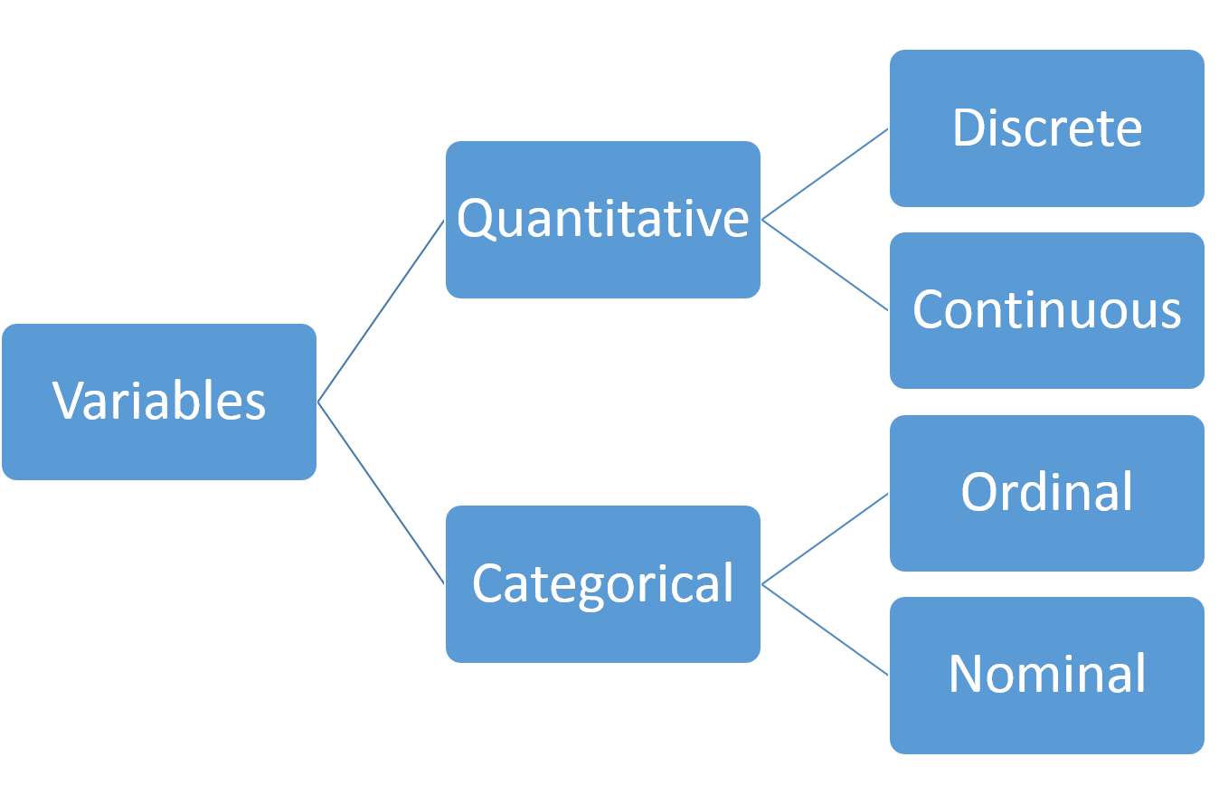
Although it is a simplistic view, Figure 3.1 provides a useful taxonomy of the types of columns we might have in our dataset. Having at least an initial inkling of the type of data matters, because it helps decide what type of summary to generate or what type of plot to make. Quantitative data are sometimes also referred to as numerical data.
There are two main ways of summarising data: numerically and graphically. This topic will cover:
Techniques for categorical variables will be covered in Section 4.1.
Before proceeding, let us introduce one of the datasets that we’ll be using in this textbook. The dataset comes from the UCI Machine Learning Repository, which is a very useful place to get datasets for practice.
Example 3.1 (Student Performance: Dataset Introduction)
The full dataset can be downloaded from this page. Once you unzip the file, you will find two csv files in the student/ folder:
student-mat.csv (performance in Mathematics)student-por.csv (performance in Portugese)Each dataset was collected using school reports and questionnaires. Each row corresponds to a student. The columns include student grades, demographic information, and other social and school-related information. Each file corresponds to the students’ performance in one of the two subjects. For more information, you can refer to Cortez and Silva (2008).
| # | Feature | Description (Type) | Details |
|---|---|---|---|
| 1 | school | student’s school (binary) | “GP” - Gabriel Pereira, “MS” - Mousinho da Silveira |
| 2 | sex | student’s sex (binary) | “F” - female, “M” - male |
| 3 | age | student’s age (numeric) | from 15 to 22 |
| 4 | address | student’s home address type (binary) | “U” - urban, “R” - rural |
| 5 | famsize | family size (binary) | “LE3” - less or equal to 3, “GT3” - greater than 3 |
| 6 | Pstatus | parent’s cohabitation status (binary) | “T” - living together, “A” - apart |
| 7 | Medu | mother’s education (numeric) | 0 - none, 1 - primary education (4th grade), 2 - 5th to 9th grade, 3 - secondary education, 4 - higher education |
| 8 | Fedu | father’s education (numeric) | 0 - none, 1 - primary education (4th grade), 2 - 5th to 9th grade, 3 - secondary education, 4 - higher education |
| 9 | Mjob | mother’s job (nominal) | teacher, health, civil services, at_home, other |
| 10 | Fjob | father’s job (nominal) | teacher, health, civil services, at_home, other |
| 11 | reason | reason to choose this school (nominal) | close to home, school reputation, course preference, other |
| 12 | guardian | student’s guardian (nominal) | mother, father, other |
| 13 | traveltime | home to school travel time (numeric) | 1 - <15 min, 2 - 15 to 30 min, 3 - 30 min to 1 hour, 4 - >1 hour |
| 14 | studytime | weekly study time (numeric) | 1 - <2 hours, 2 - 2 to 5 hours, 3 - 5 to 10 hours, 4 - >10 hours |
| 15 | failures | number of past class failures (numeric) | n if 1<=n<3, else 4 |
| 16 | schoolsup | extra educational support (binary) | yes or no |
| 17 | famsup | family educational support (binary) | yes or no |
| 18 | paid | extra paid classes within the course subject (Math or Portuguese) (binary) | yes or no |
| 19 | activities | extra-curricular activities (binary) | yes or no |
| 20 | nursery | attended nursery school (binary) | yes or no |
| 21 | higher | wants to take higher education (binary) | yes or no |
| 22 | internet | Internet access at home (binary) | yes or no |
| 23 | romantic | with a romantic relationship (binary) | yes or no |
| 24 | famrel | quality of family relationships (numeric) | from 1 - very bad to 5 - excellent |
| 25 | freetime | free time after school (numeric) | from 1 - very low to 5 - very high |
| 26 | goout | going out with friends (numeric) | from 1 - very low to 5 - very high |
| 27 | Dalc | workday alcohol consumption (numeric) | from 1 - very low to 5 - very high |
| 28 | Walc | weekend alcohol consumption (numeric) | from 1 - very low to 5 - very high |
| 29 | health | current health status (numeric) | from 1 - very bad to 5 - very good |
| 30 | absences | number of school absences (numeric) | from 0 to 93 |
In the explanatory variables above, notice that although several variables have been stored in the dataset file as numbers, they are in fact categorical variables. Examples of these are variables 24 to 29. However, it does seem fair to treat the three output columns as numeric. G3 is the main output variable.
| # | Feature | Description (Type) | Details |
|---|---|---|---|
| 31 | G1 | first period grade (numeric) | from 0 to 20 |
| 32 | G2 | second period grade (numeric) | from 0 to 20 |
| 33 | G3 | final grade (numeric, output target) | from 0 to 20 |
Numerical summaries include:
Example 3.2 (Student Performance: Numerical Summaries)
Let us read in the dataset and generate numerical summaries of the output variable of interest (G3).
From the output, we can understand that we have 395 observations, ranging from 0 to 20. I would surmise that the data is more or less symmetric in the middle (distance from 3rd-quartile to median is identical to distance from median to 1st-quartile). There are no missing values in the data.
However, summaries of a single variable are rarely useful since we do not have a basis for comparison. In this dataset, we are interested in how the grade varies with one or some of the other variables. Let’s begin with Mother’s education.
  Medu G3.Min. G3.1st Qu. G3.Median G3.Mean G3.3rd Qu. G3.Max.
1    0    9.00      12.00     15.00   13.00      15.00   15.00
2    1    0.00       7.50     10.00    8.68      11.00   16.00
3    2    0.00       8.00     11.00    9.73      13.00   19.00
4    3    0.00       8.00     10.00   10.30      13.00   19.00
5    4    0.00       9.50     12.00   11.76      15.00   20.00
  0   1   2   3   4
3 59 103 99 131 G3
count mean std min 25% 50% 75% max
Medu
0 3.0 13.000000 3.464102 9.0 12.0 15.0 15.0 15.0
1 59.0 8.677966 4.364594 0.0 7.5 10.0 11.0 16.0
2 103.0 9.728155 4.636163 0.0 8.0 11.0 13.0 19.0
3 99.0 10.303030 4.623486 0.0 8.0 10.0 13.0 19.0
4 131.0 11.763359 4.267646 0.0 9.5 12.0 15.0 20.0Now we begin to understand the context of G3 a little better. As the education level of the mother increases, the mean does increase. The middle 50-percent of the grade does seem to increase as well. The exception is the case where the mother has no education, but we can see that there are only 3 observations in that category, so we should not read too much into it.
Here are some things to note about numerical summaries:
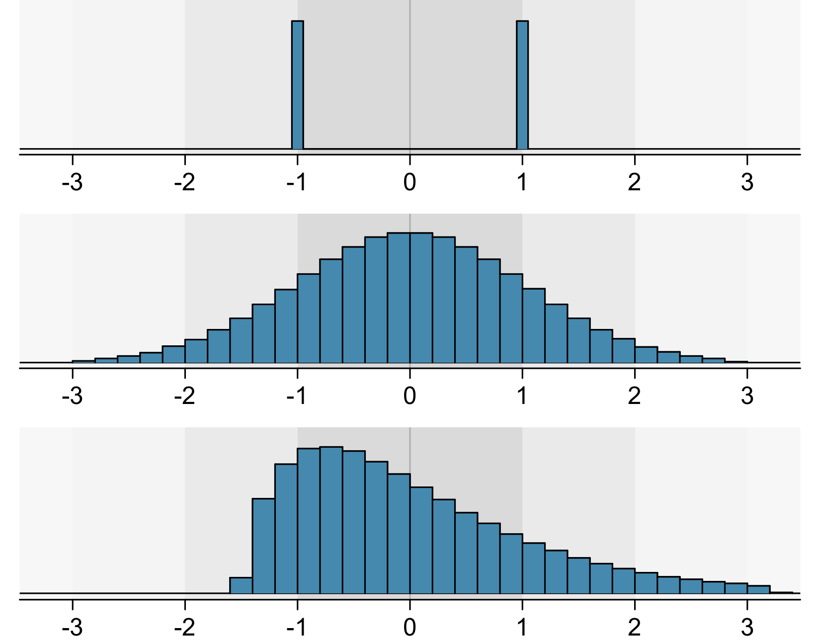
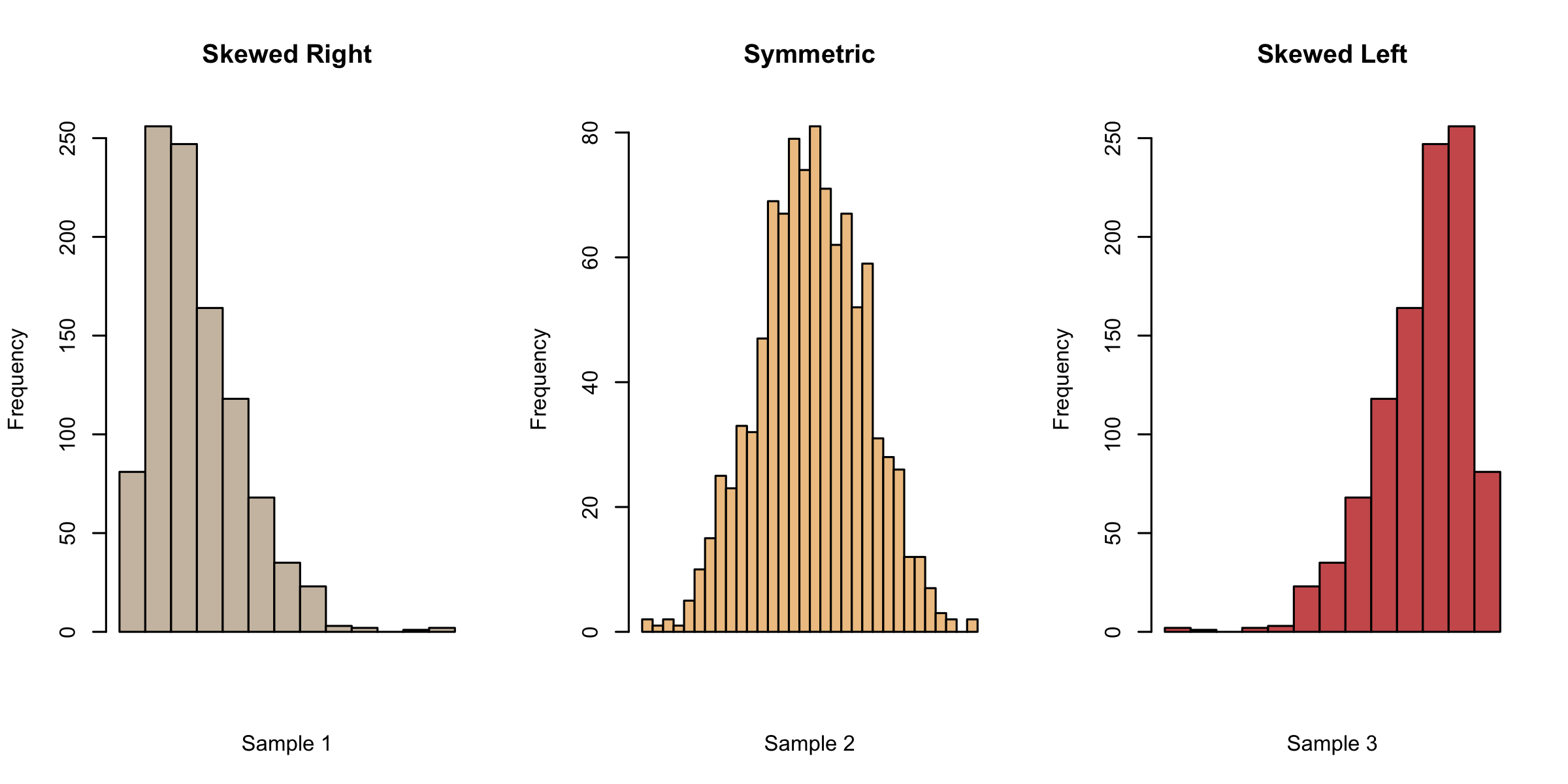
While numerical summaries provide us with some basic information about the data, they also leave out a lot. Even for experts, it is possible to have a wrong mental idea about the data from the numerical summaries alone. For instance, all three histograms in Figure 3.2 have a mean of 0 and standard deviation of 1!
That’s why we have to turn to graphics as well, in order to summarise our data.
The first chart type we shall consider is a histogram. A histogram is a graph that uses bars to portray the frequencies or relative frequencies of the possible outcomes for a quantitative variable.
When we create a histogram, here are some things that we look for:
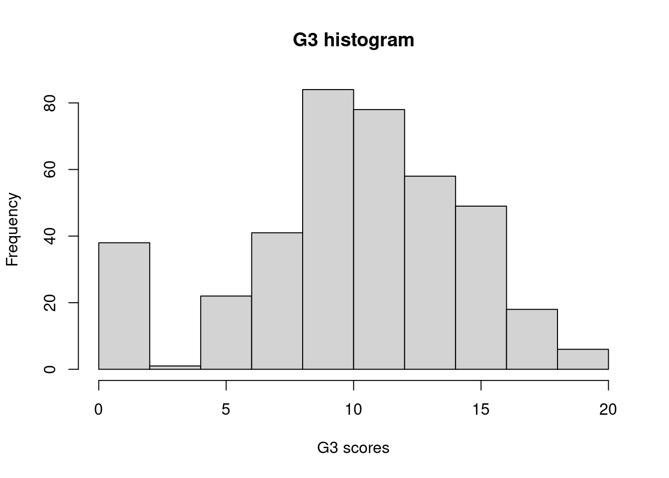
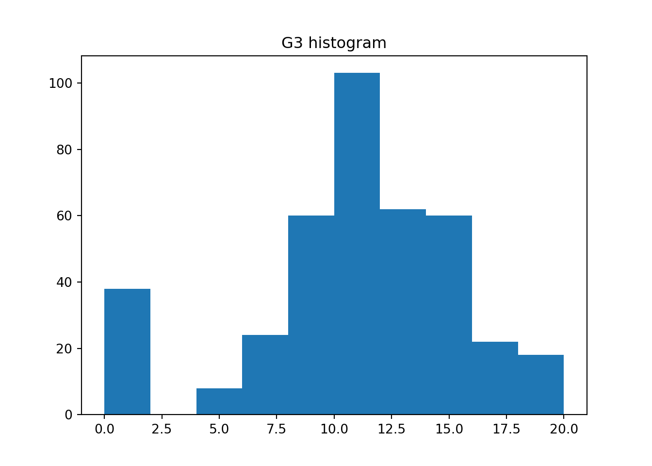
Example 3.3 (Student Performance: Histograms)
Now let us return to the student performance dataset.
Do you notice any differences between the two histograms?
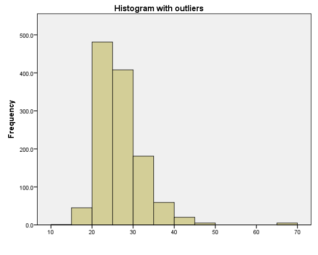
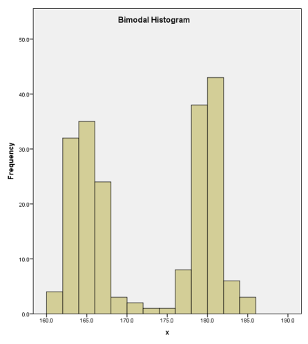
In general, we now have a little more information to accompany the 5 number summaries. It appears that the distribution is not a basic unimodal one. There is a large spike of about 40 students who scored very low scores.
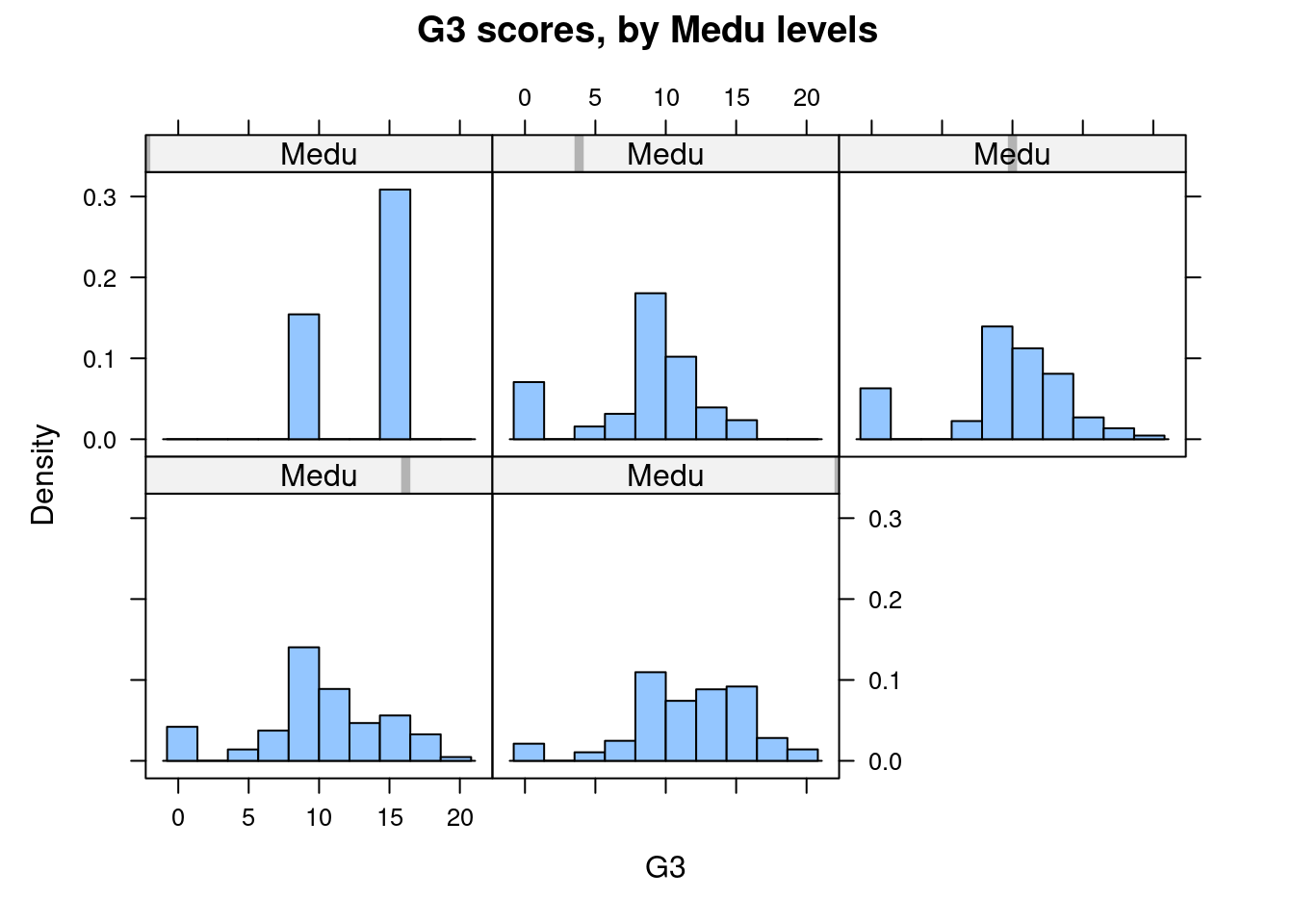
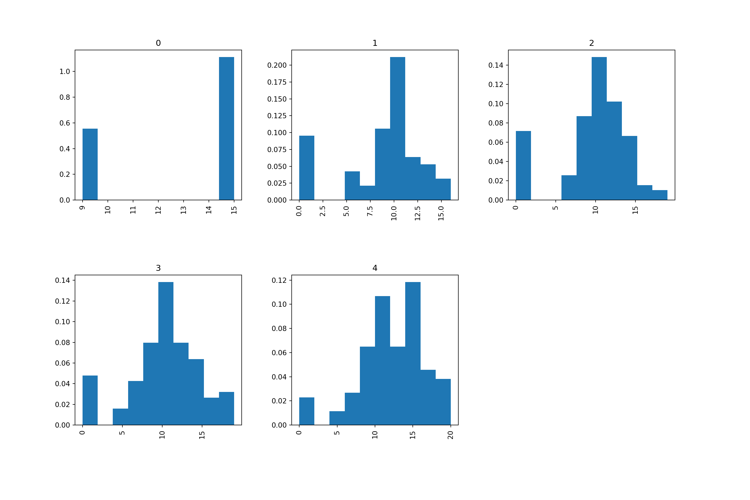
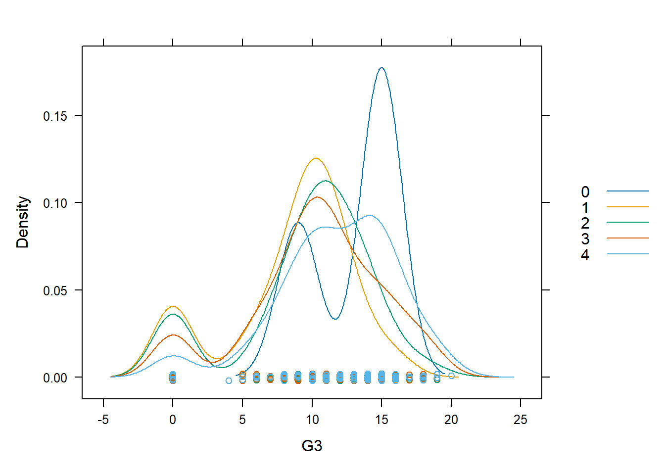
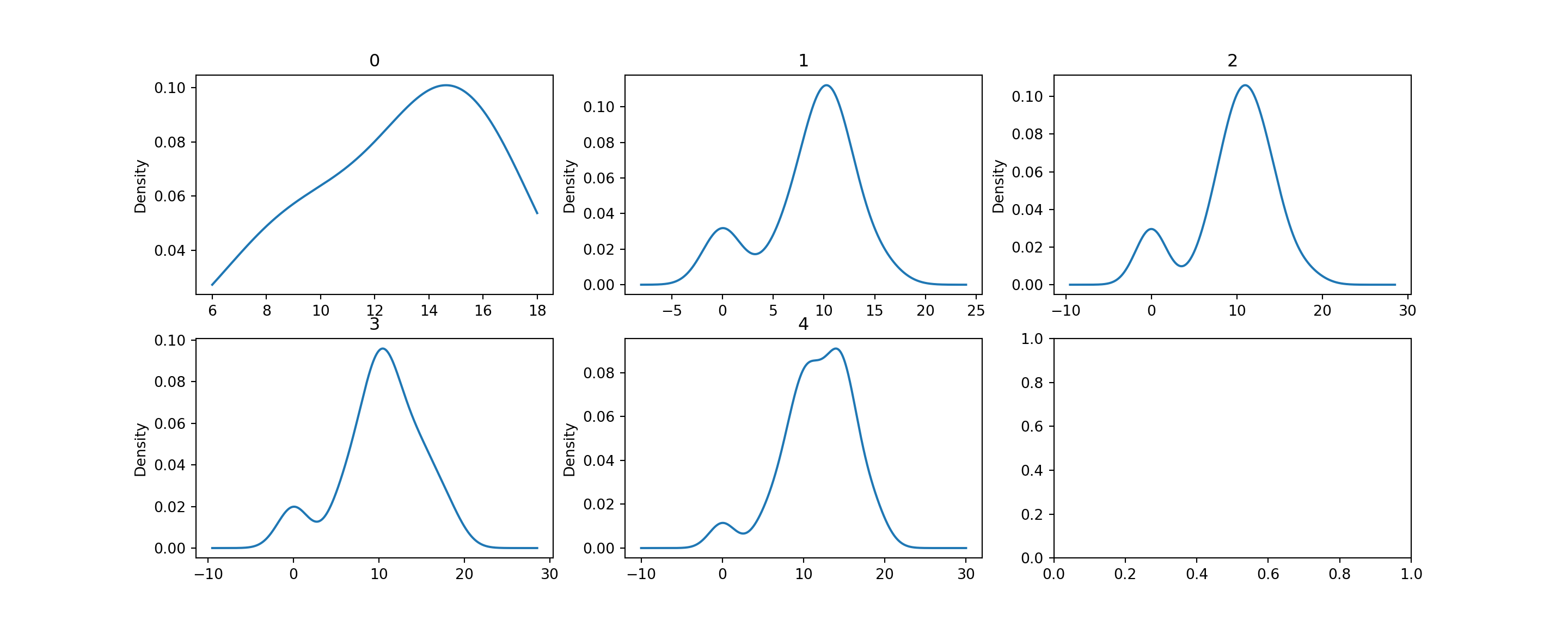
As we mentioned earlier, it is not useful to inspect a histogram in a silo. Hence we shall condition on Mother’s education once more, to create separate histograms for each group. Remember that this is a case where the response variable G3 is quantitative, and the explanatory variable Medu is ordinal.
Although the heights of the panels in the two versions are not identical, we can, by looking at either one, see that the proportion of 0-scores reduces as the mother’s education increases. Perhaps this is reading too much into the dataset, but there seem to be more scores on the higher end for highest educated mothers.
Histograms are not perfect - when using them, we have to experiment with the bin size since this could mask details about the data. It is also easy to get distracted by the blockiness of histograms. An alternative to histograms is the kernel density plot. Essentially, this is obtained by smoothing the heights of the rectangles in a histogram.
Suppose we have observed an i.i.d sample \(x_1, x_2, \ldots, x_n\) from a continuous pdf \(f(\cdot)\). Then the kernel density estimate at \(x\) is given by
\[ \hat{f}(x) = \frac{1}{nh} \sum_{i=1}^n K \left( \frac{x - x_i}{h} \right) \] where
Example 3.4 (Student Performance: Density Estimates)
Here is how we can make density plots with R and Python for the G3 scores.
As you can see, with density plots it is also possible to overlay them for closer comparison. This is not possible with histograms without some transparency in the rectangle colours.
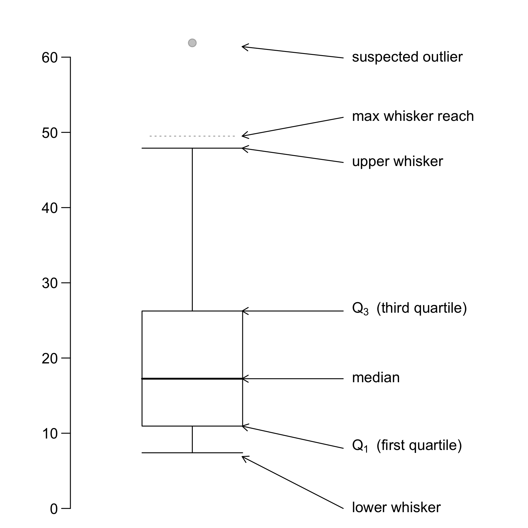
A boxplot provides a skeletal representation of a distribution. Boxplots are very well suited for comparing multiple groups.
Here are the steps for drawing a boxplot:
A boxplot helps us to identify the median, lower and upper quantiles and outlier(s) (see Figure 3.8).
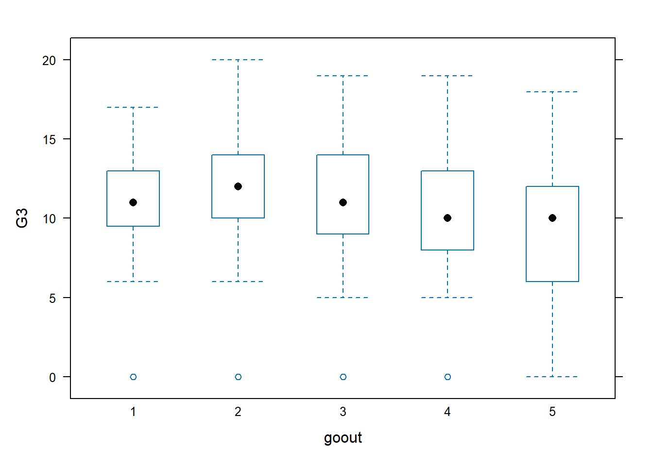
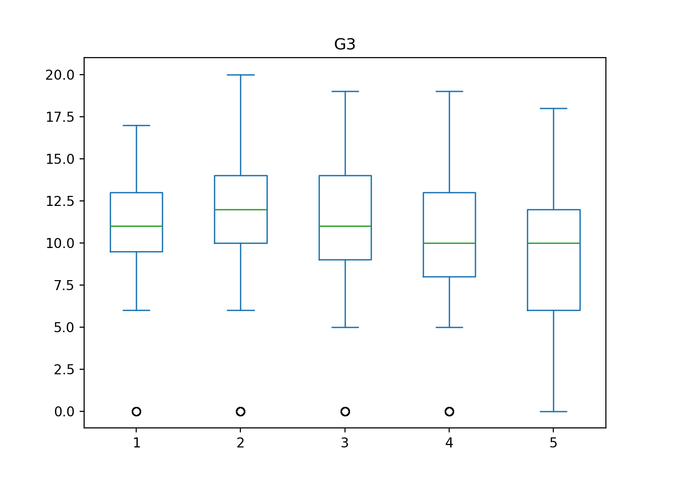
Example 3.5 (Student Performance: Boxplots)
This time, instead of using mother’s education, we use the number of times a student goes out (goout) as the explanatory variable. From the boxplot outputs, it appears there is no strong strictly increasing/decreasing trend associated with G3. Instead, although the differences between the categories are not large, it seems as though there is an “optimal” number of times that students could go out. Too little and too much going out leads to lower median G3 scores.
Finally, we turn to QQ-plots. A Quantile-Quantile plot is a graphical diagnostic tool for assessing if a dataset follows a particular distribution. Most of the time we would be interested in comparing against a Normal distribution.
A QQ-plot plots the standardized sample quantiles against the theoretical quantiles of a N(0; 1) distribution. If the points fall on a straight line, then we say there is evidence that the data comes from a Normal distribution.
Especially for unimodal datasets, the points in the middle will typically fall close to the line. The value of a QQ-plot is in judging if the tails of the data are fatter or thinner than the tails of the Normal.
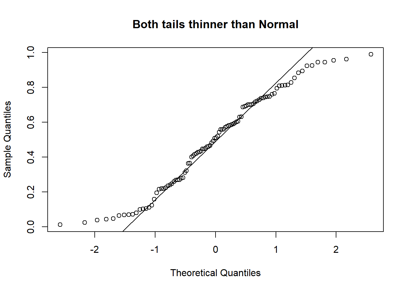
Please be careful! Some software/packages will switch the axes (i.e. plot the sample quantiles on the x-axis instead of the y-axis, unlike Figure 3.9). Please observe and interpret accordingly.
Example 3.6 (Concrete Slump: Dataset Introduction)
Concrete is a highly complex material. The slump flow of concrete is not only determined by the water content, but also by other ingredients. The UCI page for this particular dataset is here. The reference article on this dataset is Yeh (2007).
The data set includes 103 data points. There are 7 input variables, and 3 output variables in the data set. These are the input columns in the data, all in units of \(kg/m^3\) concrete:
| # | Feature | Details |
|---|---|---|
| 1 | Cement | |
| 2 | Slag | |
| 3 | Fly ash | |
| 4 | Water | |
| 5 | SP | A super plasticizer to improve consistency. |
| 6 | Coarse Aggr. | |
| 7 | Fine Aggr. |
There are three output variables in the dataset. You can read more about Slump and Flow from this wikipedia page.
| # | Feature | Units |
|---|---|---|
| 1 | SLUMP | cm |
| 2 | FLOW | cm |
| 3 | 28-day Compressive Strength | MPa |
To read the data into R:
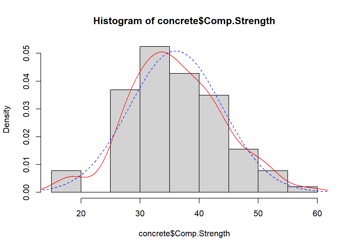
Let us consider the Comp.Strength output variable. The histogram overlay in Figure 3.10 suggests some skewness and fatter tails than the Normal.
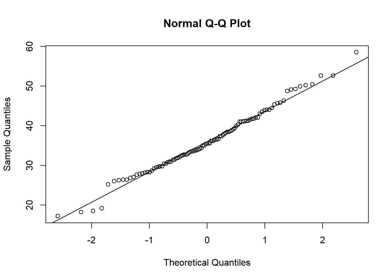
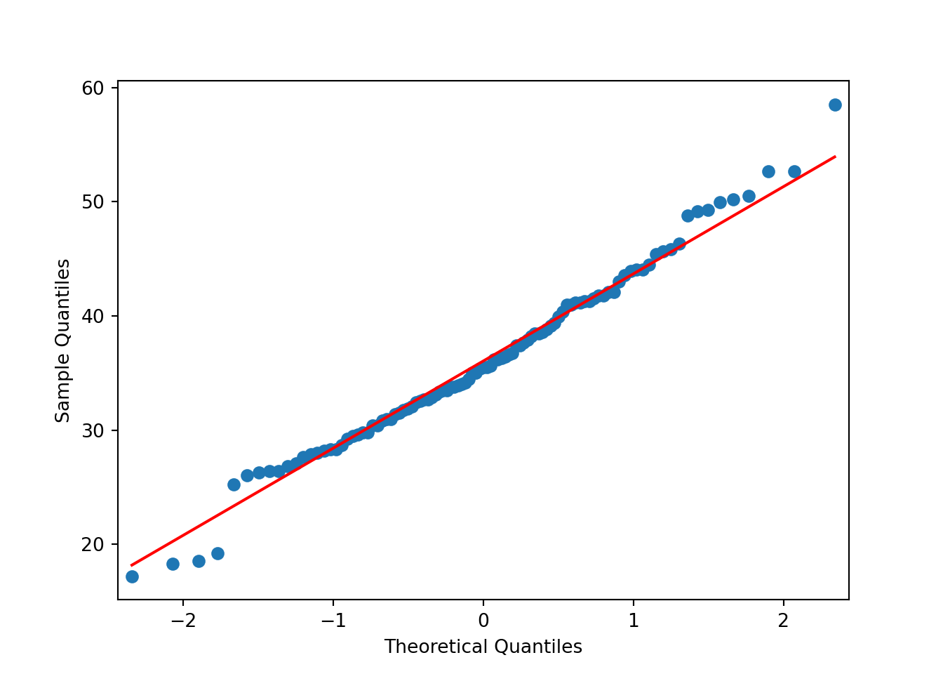
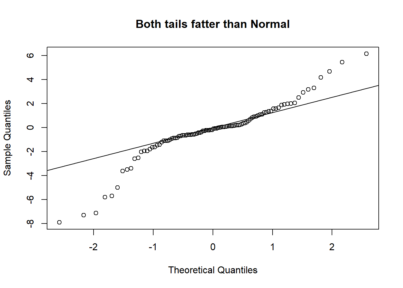
Example 3.7 (Concrete: QQ-plots)
The next chart is a QQ-plot, for assessing deviations from Normality.
The deviation of the tails does not seem to be that large, judging from the QQ-plot.
When we are studying two quantitative variables, the most common numerical summary to quantify the relationship between them is the correlation coefficient. Suppose that \(x_1, x_2, \ldots, x_n\) and \(y_1, \ldots, y_n\) are two variables from a set of \(n\) objects or people. The sample correlation between these two variables is computed as:
\[ r = \frac{1}{n-1} \sum_{i=1}^n \frac{(x_i - \bar{x})(y_i - \bar{y})}{s_x s_y} \] where \(s_x\) and \(s_y\) are the sample standard deviations. \(r\) is an estimate of the correlation between random variables \(X\) and \(Y\).
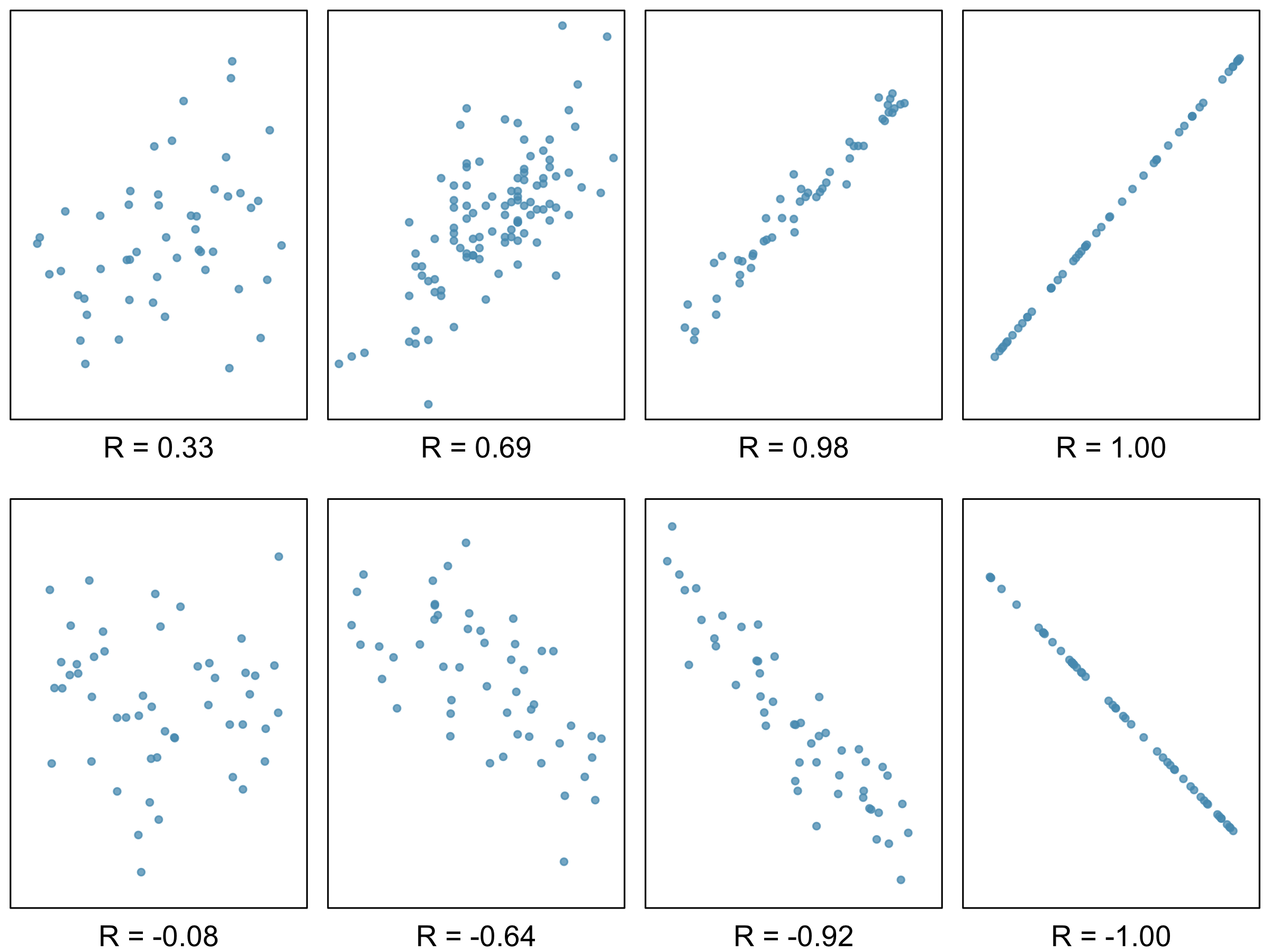
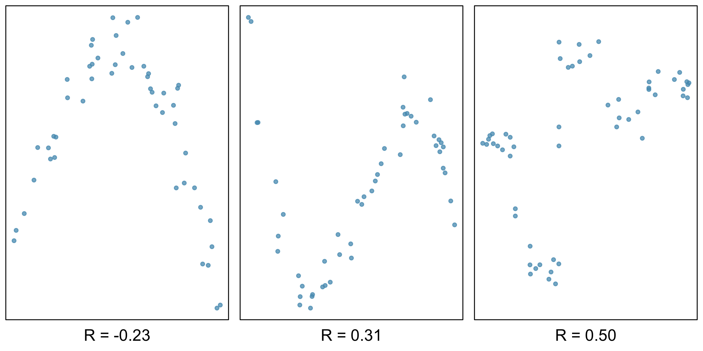
A few things to note about the value \(r\), which is also referred to as the Pearson correlation:
Figure 3.11 and Figure 3.12 contain sample plots of data and their corresponding \(r\) values. Notice how \(r\) does not reflect strong non-linear relationships.
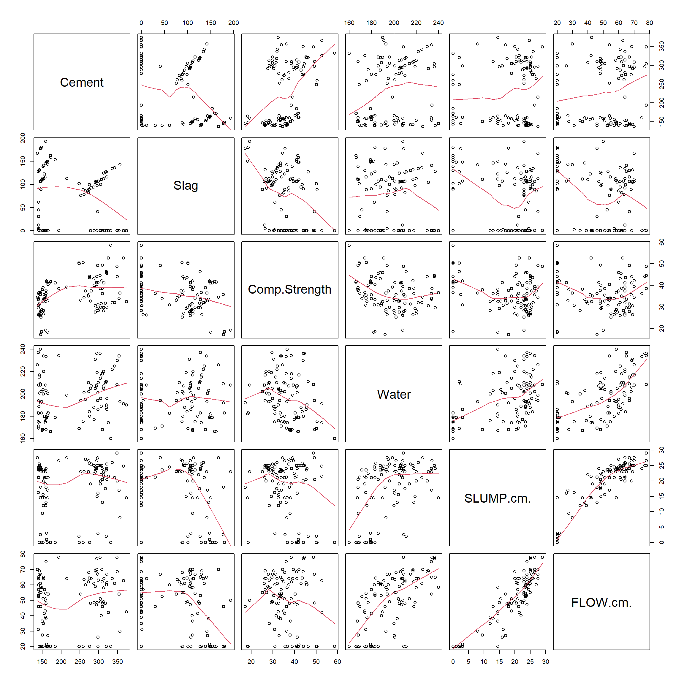
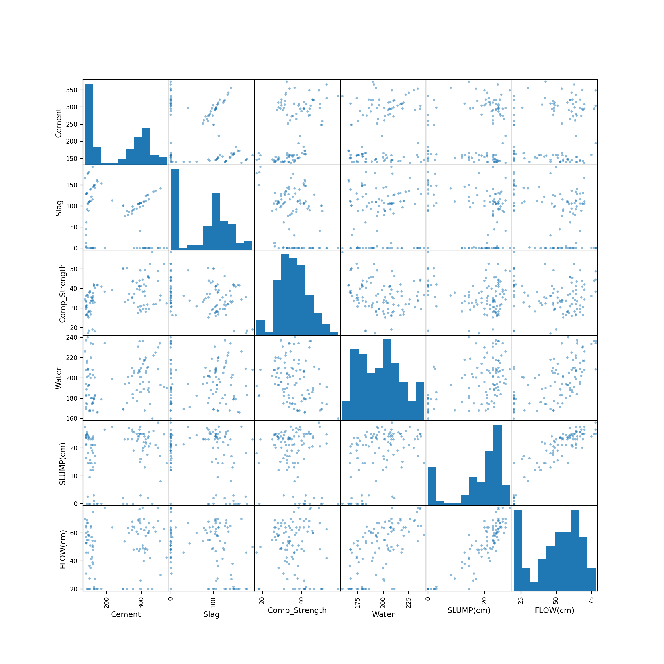
Example 3.8 (Concrete: Scatterplots) When we have multiple quantitative variables in a dataset, it is common to create a matrix of scatterplots. This allows for simultaneous inspection of bivariate relationships.
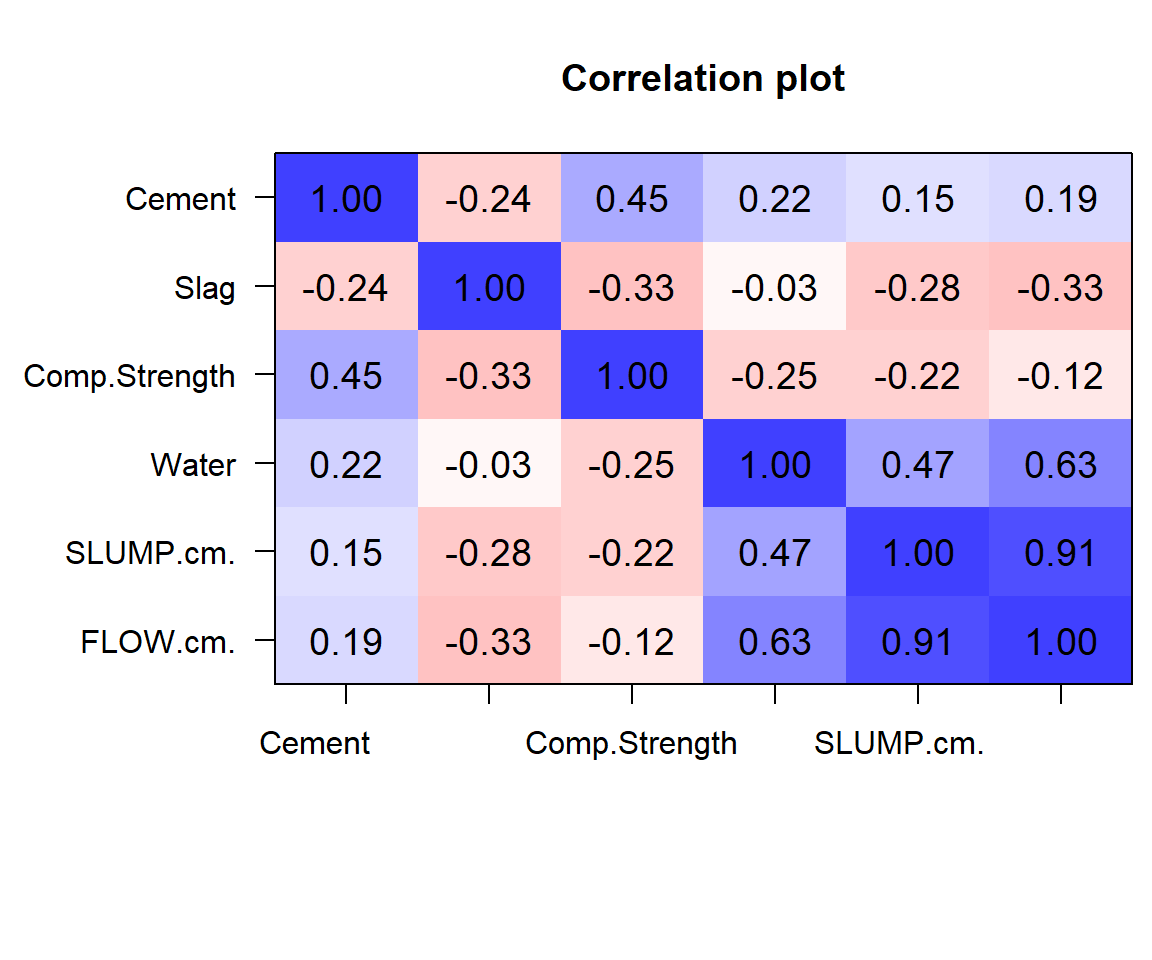
We can see that a few of the variables have several 0 values - cement, slag, slump and flow. Water appears to have some relation with slump and with flow.
The scatterplots allow a visual understanding of the patterns, but it is usually also good to compute the correlation of all pairs of variables.
The interactive heatmap created by Python is only available in the HTML format of the textbook.
| Cement | Slag | Comp_Strength | Water | SLUMP(cm) | FLOW(cm) | |
|---|---|---|---|---|---|---|
| Cement | 1.000000 | -0.243553 | 0.445725 | 0.221091 | 0.145913 | 0.186461 |
| Slag | -0.243553 | 1.000000 | -0.331588 | -0.026775 | -0.284037 | -0.327231 |
| Comp_Strength | 0.445725 | -0.331588 | 1.000000 | -0.254235 | -0.223358 | -0.124029 |
| Water | 0.221091 | -0.026775 | -0.254235 | 1.000000 | 0.466568 | 0.632026 |
| SLUMP(cm) | 0.145913 | -0.284037 | -0.223358 | 0.466568 | 1.000000 | 0.906135 |
| FLOW(cm) | 0.186461 | -0.327231 | -0.124029 | 0.632026 | 0.906135 | 1.000000 |
The plots you see above are known as heatmaps. They enable us to pick out groups of variables that are similar to one another. As you can see from the blue block in the lower right corner, Water, SLUMP.cm and FLOW.cm are very similar to one another.
In the questions, do try to answer each question using both R and Python whenever possible.
bw argument)? Experiment with different values to understand more.G3 scores, by goout, and compare the groups.