import pandas as pd
import numpy as np
import datetime, calendar
from statsmodels.tsa.seasonal import seasonal_decompose,STL
from statsmodels.tsa.statespace.tools import diff
from statsmodels.tsa.stattools import acf
from statsmodels.tsa.forecasting.theta import ThetaModel
from statsmodels.tsa.arima.model import ARIMA
from statsmodels.tsa.statespace import exponential_smoothing

from statsmodels.tsa.api import (
  ExponentialSmoothing, SimpleExpSmoothing, Holt, STLForecast
)

import pmdarima as pm

from scipy.cluster import hierarchy
from scipy.spatial.distance import pdist,squareform

from ind5003 import ts

import matplotlib.pyplot as plt
import seaborn as sns6 Time Series Analysis
6.1 Exploring Time Series Data
One of the first things that we do when we are given a time series is visualise it. The visualisation is meant to give us an indication of what kinds of techniques would be suitable for forecasting it. In this section, we shall learn several methods to visualise a time series dataset.
When we visualise a time series, we look out for the following features:
- Trend: A trend exists when there is a long-term increase or decrease in the data.
- Level: The level of a series refers to its height on the ordinate axis.
- Seasonal: A seasonal pattern exists when a series is influenced by factors such as quarters of the year, the month, the day of the week, or time of day. Seasonality is always of a fixed and known period.
- Cyclic: A cyclic pattern exists when there are rises and falls that are not of a fixed period.
Example 6.1 (Basic plot of housing data)
This dataset comes from an R package fma. It contains counts of monthly sales of new one-family houses sold in the USA since 1973.
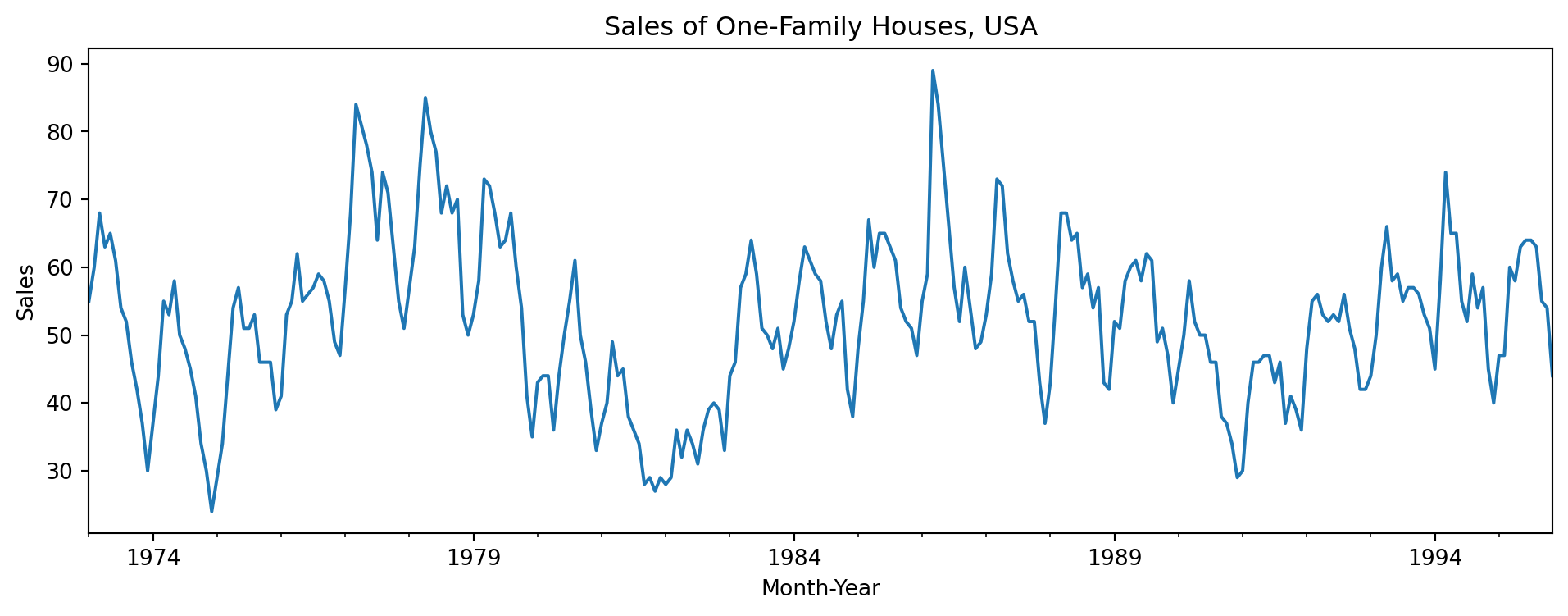
In Figure 6.1, we observe a strong seasonality within each year. There is some indication of cyclic behaviour every 6 – 10 years. There is no apparent monotonic trend over this period. With pandas objects, we can resample the series. This allows us to compute summaries over time windows that could be of business importance. For instance, we might be interested in a breakdown by quarters instead of months.
With the resample() function, we can perform both downsampling (reducing the frequency of observations) or upsampling (via interpolation or nearest neighbour imputation).
| hsales | |
|---|---|
| date | |
| 1973-01-01 | 55.000000 |
| 1973-01-15 | 56.666667 |
| 1973-01-29 | 58.333333 |
| 1973-02-12 | 62.666667 |
| 1973-02-26 | 65.333333 |
Note
See the page on date-offset objects for details and options on the strings that you can put within the resample method.
Example 6.2 (Season plots of housing data)
A season plot allows us to visualise what happens within a season. In this case, each line in the graph below traces the behaviour of the series from the beginning of the season till the end (from Jan to Dec).
hsales.loc[:, 'year'] = hsales.index.year
hsales.loc[:, 'month'] = hsales.index.month

yrs = np.sort(hsales.year.unique())
color_ids = np.linspace(0, 1, num=len(yrs))
colors_to_use = plt.cm.YlOrRd(color_ids)

plt.figure(figsize=(10, 6))

for i,yr in enumerate(yrs):
    df_tmp = hsales.loc[hsales.year == yr, :]
    plt.plot(df_tmp.month, df_tmp.hsales, color=colors_to_use[i]);
    plt.text(12.1, df_tmp.hsales.iloc[-1], str(yr), color=colors_to_use[i])
plt.title('Season Plot: House Sales')
plt.xlim(0, 13)
plt.xticks(np.arange(1, 13), calendar.month_abbr[1:13]);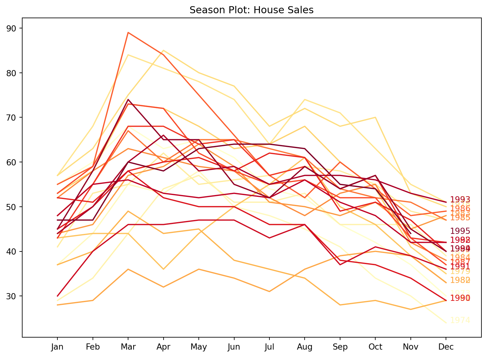
In general, from Figure 6.2, it looks like there is a peak around Feb to March, after which sales descend until the next January. Using a colour map with colours that we can “order” allows us to identify a trend across seasons. In this case, there isn’t one, but if you take a look at Figure 6.4, you will see a clear association between the colour of line and level of each series within a year.
Example 6.3 (Australian quarterly electricity production)
This dataset is from another R package: fpp2. It records quarterly electric production in Australia (in billion kWh) from 1965 till now.
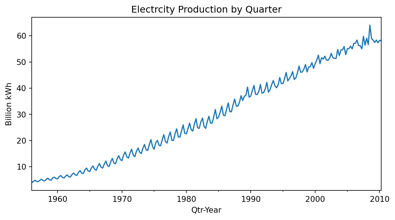
Figure 6.3 shows a very clear increasing trend. There is strong seasonality, and there is no evidence of cyclic behaviour (see Figure 6.4).
qau2 = qau.copy()

qau2.loc[:, 'year'] = qau2.index.year
qau2.loc[:, 'qtr'] = qau2.index.quarter
yrs = np.sort(qau2.year.unique())
color_ids = np.linspace(0, 1, num=len(yrs))
colors_to_use = plt.cm.YlOrRd(color_ids)

plt.figure(figsize=(10, 5))

for i,yr in enumerate(yrs):
    df_tmp = qau2.loc[qau2.year == yr, :]
    plt.plot(df_tmp.qtr, df_tmp.kWh, color=colors_to_use[i]);
    plt.text(4.1, df_tmp.kWh.iloc[-1], str(yr), color=colors_to_use[i])
plt.title('Season Plot: Electricity Production')
plt.xlim(0, 5)
plt.xticks(np.arange(1, 5), ['Q1', 'Q2', 'Q3', 'Q4']);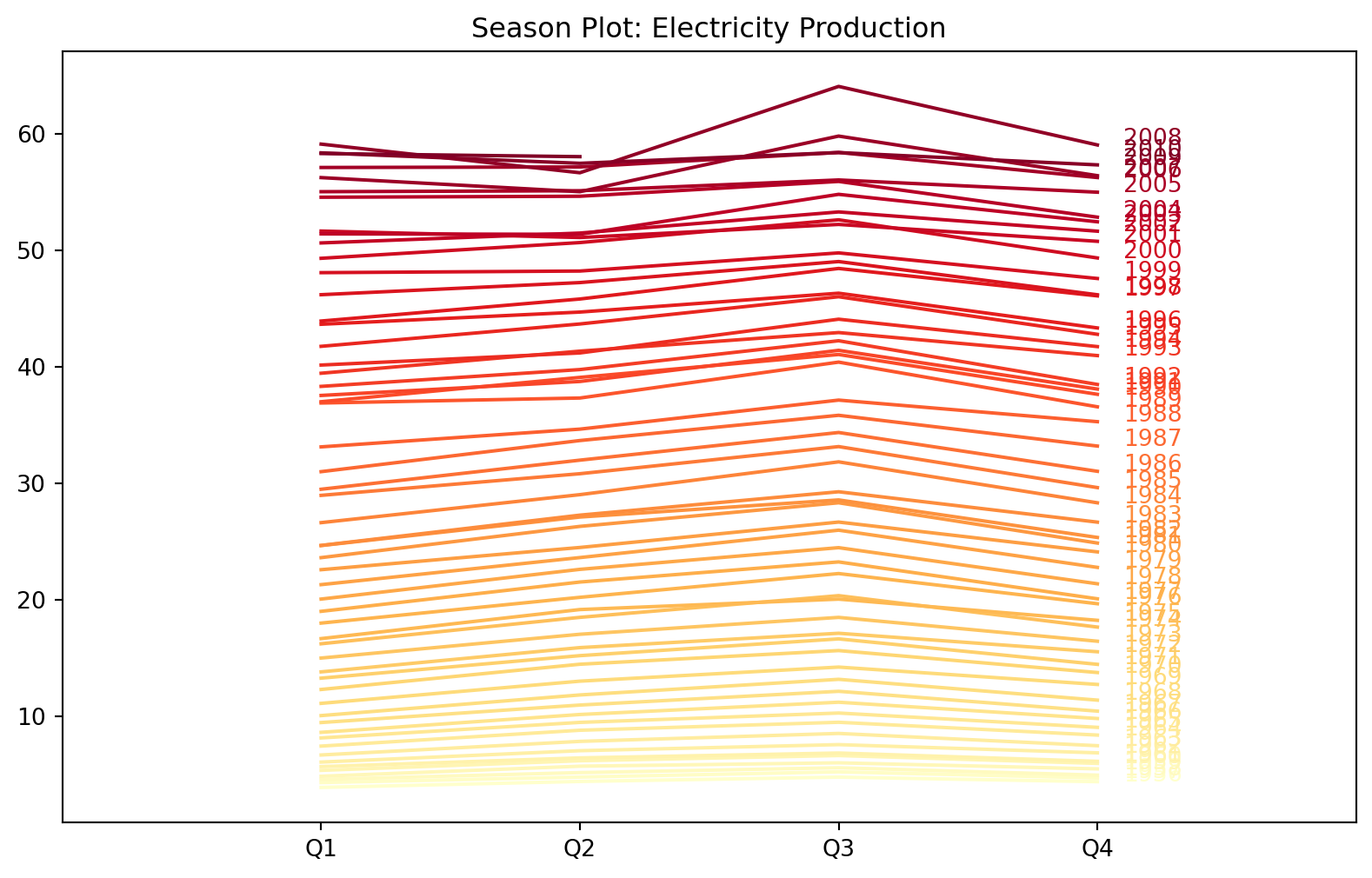
Most time series models are autoregressive in nature. This means that they attempt to predict future observations based on previous ones. The observations from the past could be from the time series that we are interested in, or they could be from other time series that we believe are related.
When beginning with model fitting, we would want to have some idea about the extent to which past observations affect the current one. In other words, how many of the past observations should we include when forecasting new observations? Lag plots and autocorrelation functions (acf) are the tools that we use to answer this question.
If we denote the observation of a time series as \(y_t\), then a lag plot at lag \(k, k > 0\) is a scatter plot of \(y_t\) against \(y_{t-k}\). It allows us to visually assess if the observations that are \(k\) units of time apart are associated with one another. We typically plot several lags at once to observe this relationship.
Example 6.4 (Lag plots of housing sales data)
Figure 6.5 displays a matrix of lag plots for the housing sales data (see Figure 6.1 and Figure 6.2 for reference).
f, aa = plt.subplots(nrows=3,ncols=4, sharex=True, sharey=True)
f.set_figheight(9)
f.set_figwidth(12)

y = hsales.hsales.values
for i in np.arange(0, 3):
    for j in np.arange(0, 4):
        lag = i*4 + j + 1
        aa[i,j].scatter(y[:-lag], y[lag:], alpha=0.4)
        aa[i,j].set_xlabel("lag " + str(lag))
f.suptitle('Lag plots');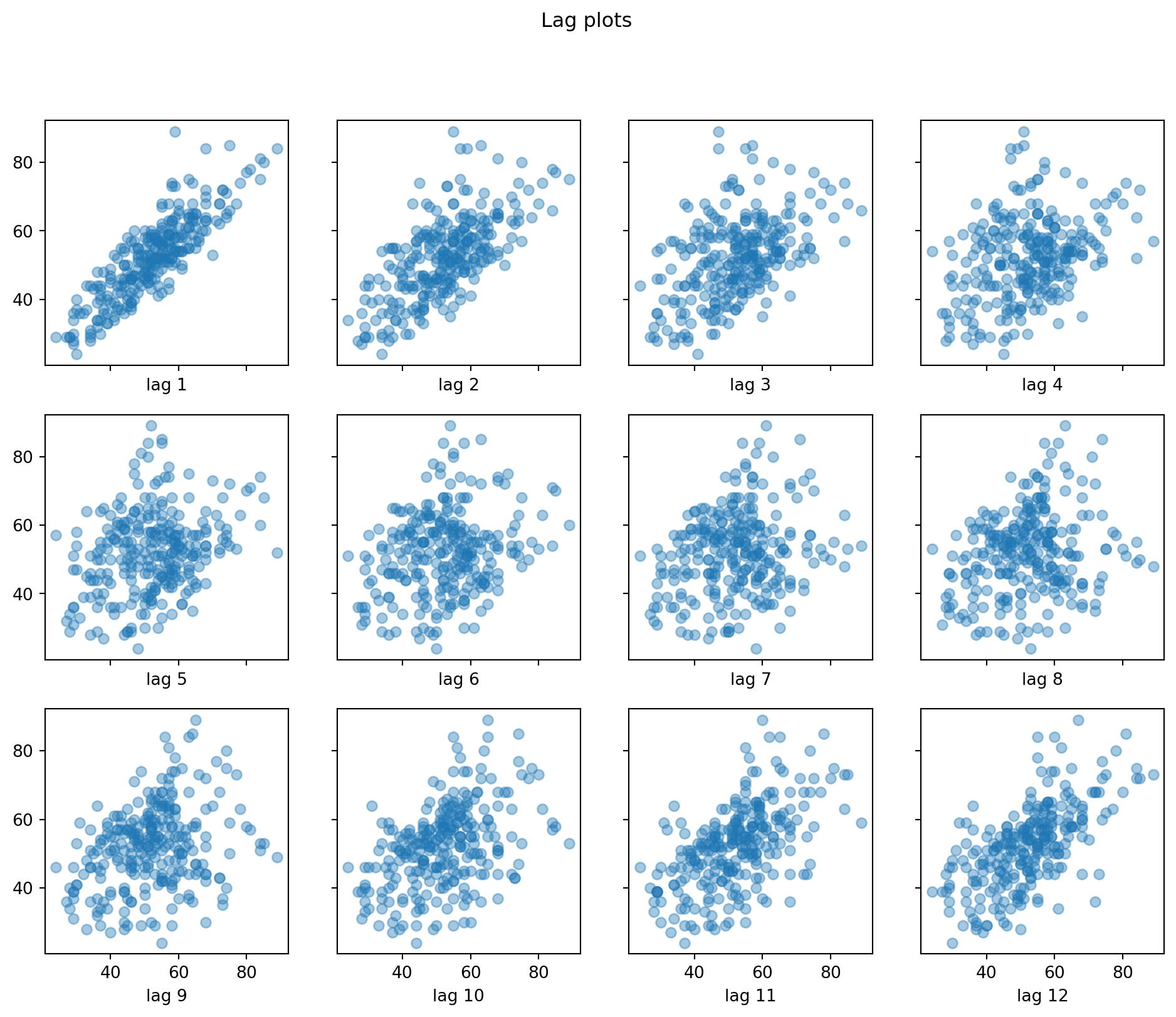
6.2 Decomposing Time Series Data
In this section, our goal is still primarily exploratory, but it will also return information that we can use to model our data later on. We aim to break the time series readings into:
- a trend-cycle component,
- a seasonal component, and
- a remainder component.
If we can forecast these components individually, we can combine them to provide forecasts for the original series (see Section 6.3.5). There are two basic methods of decomposition into the above components: an additive one, and a multiplicative one. In the additive decomposition, we assume that the components contribute in an additive manner to \(y_t\):
\[\begin{equation} y_t = S_t + T_t + R_t \end{equation}\]
In the multiplicative decomposition, we assume the following relationship holds: \[\begin{equation} y_t = S_t \times T_t \times R_t \end{equation}\]
When we are in the multiplicative case, we sometimes apply the logarithm transform to the data, which returns to an additive model: \[\begin{equation} \log y_t = \log S_t + \log T_t + \log R_t \end{equation}\]
A typical algorithm to decompose time series data would work like this:
- Estimate the trend component. Let us call it \(\hat{T}_t\).
- Obtain the de-trended data \(y_t - \hat{T}_t\) or \(y_t / \hat{T}_t\) as appropriate.
- Estimate the seasonal component. For instance, we could simply average the values in each month. Let us denote this estimate as \(\hat{S}_t\).
- Estimate the remainder component. For instance, in the additive model, it would be \(\hat{R}_t = y_t - \hat{T}_t - \hat{S}_t\).
Example 6.5 (Additive decomposition, housing sales)
Figure 6.6 contains the naive additive decomposition of the housing sales data.
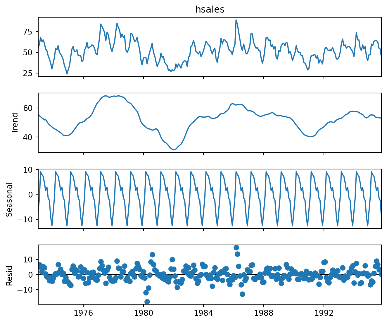
When we inspect a decomposition, there are certain elements that we watch out for. One of them is to compare the range of the \(y\)-axis for the three components. In Figure 6.6, we observe that the rough spread of the trend component (second row) is about 40. On the other hand, the spread of the seasonal component (third row) is roughly 20. This suggests that the seasonal component is a significant driver of the overall variation of the process.
The fact that the seasonal pattern does not change over time is an artifact of the decomposition; it is not always a true reflection of the true pattern.
Finally, as always, we hope to see the residuals to be centred around 0, with little or no trend, and a constant variability over time.
Example 6.6 (Multiplicative decomposition, Aus electricity data)
Figure 6.7 the multiplicative decomposition for the Australian electric data.
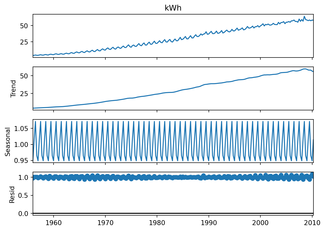
Take note that in multiplicative decompositions, the residuals are centred around 1, not zero.
As you may have noticed, there are some issues with the classical seasonal decomposition algorithms. These include:
- an inability to estimate the trend at the ends of the series.
- an inability to account for changing seasonal components.
- it is not robust to outliers.
Example 6.7 (STL decomposition, Aus electricity)
Newer algorithms such as STL decomposition, X11 and others attempt to address these issues. They use locally weighted regression models to obtain the trend. These algorithms iterate over the time series several times, so as to ensure that outliers are not affecting the outcome. For full details on STL (Seasonal Trend decomposition with Loess), please refer to the original paper Cleveland et al. (1990).
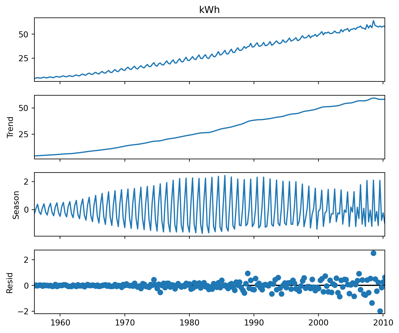
Notice in Figure 6.8 how the seasonal pattern varies over time. One disadvantage of the STL decomposition, however, is that it can only return an additive decomposition.
6.3 Forecasting
Benchmark methods
As in all forecasting methods, it is useful to obtain a baseline forecast before proceeding to more sophisticated techniques. Baseline forecasts are usually obtained from simple, intuitive methods.
Note
Take note in the sections that follow, the notation \(\hat{y}_{T+h|T}\) refers to the forecasted value of the time series at time \(T+h\), given observations until and including time \(T\).
Here are some baseline methods:
A. The simple mean forecast:
\[\begin{equation}
\hat{y}_{T+h | T} = \frac{y_1 + y_2 + y_3 + \cdots + y_T}{T}
\end{equation}\]
B. The naive forecast: \[\begin{equation} \hat{y}_{T+h | T} = y_T \end{equation}\]
C. The seasonal naive forecast.
Suppose that the season contains \(d\) periods (for instance, in monthly data, \(d=12\)). Then the seasonal naive forecast utilises the most recent observed period for the forecast:
\[\begin{equation} \hat{y}_{T+h | T} = y_{T-d+h} \end{equation}\]
Example 6.8 (Benchmark forecasts housing sales)
Suppose we apply some of the above forecasts to the housing sales dataset. We withhold the most recent 2 years of data and forecast those. Take a look at Figure 6.9, that depicts the forecasts along with the true values.
# Set aside the last two years as the test set.
#hsales = hsales.drop(columns=['year', 'month'])
train_set = hsales.iloc[:-24,]
test_set = hsales.iloc[-24:, ]

# Obtain the forecast from the training set
mean_forecast = ts.meanf(train_set.hsales, 24)
snaive_forecast = ts.snaive(train_set.hsales, 24, 12)

# Plot the predictions and true values
ax = train_set.hsales.plot(title='Benchmarks', legend=False, figsize=(12,4.5))
test_set.hsales.plot(ax=ax, legend=False, style='--')
mean_forecast.plot(ax=ax, legend=True, style='-')
snaive_forecast.plot(ax=ax, legend=False, style='-')
plt.legend(labels=['train', 'test', 'mean', 'snaive'], loc='lower right');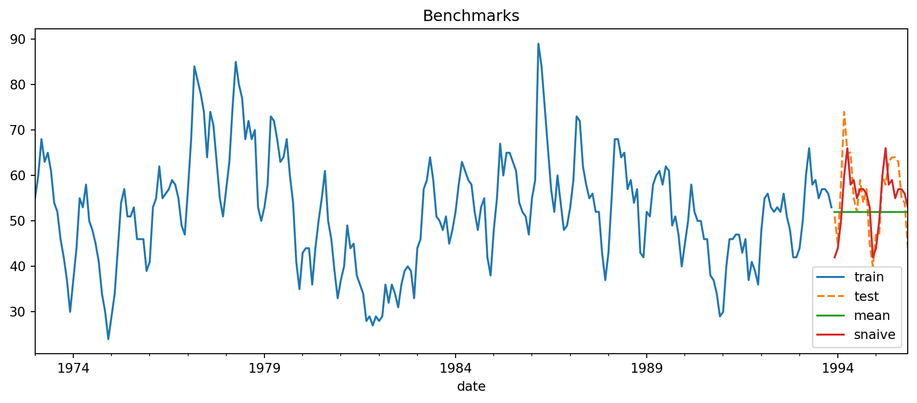
When assessing forecasts, there are a few different metrics that are typically applied. Each of them has it’s own set of pros and cons. If we denote the predicted value with \(\hat{y}_t\), then these are the formulas for three of the most common error metrics used in time series forecasting
A. RMSE: \[\begin{equation} \sqrt{\frac{1}{h} \sum_{i=1}^h (y_{t+i} - \hat{y}_{t+i})^2 } \end{equation}\]
B. MAE \[\begin{equation} \frac{1}{h} \sum_{i=1}^h |y_{t+i} - \hat{y}_{t+i}| \end{equation}\]
C. Mean Absolute Scaled Error
\[\begin{equation} \frac{1}{h} \sum_{i=1}^h \frac{|y_{t+i} - \hat{y}_{t+i}|}{ \frac{1}{T-1} \sum_{t=2}^T |y_t - y_{t-1}|} \end{equation}\]
The RMSE and MAE are scale dependent errors. It is difficult to compare the errors across series, or to aggregate errors across different time series with it. Due to the square in the formula, the RMSE is quite sensitive to outliers. The MAE is more robust to outliers.
The MASE is a scaled error - it allows us to compare the forecasting performance across time series. The other two metrics depend on the scale of the time series and hence do not allow us to make such comparisons.
Example 6.9 (Benchmark forecast errors)
Let us assess the forecasts made in Example 6.8, using RMSE and MAE.
rmse,mean: 9.023
rmse,snaive: 5.906
---
mae,mean: 7.562
mae,snaive: 4.792
---
In our simple example, the seasonal naive model outperforms the simple mean forecast according to all the metrics but in general, things are not always this clear-cut.
For reference, the MASE for the seasonal naive forecast is as follows.
ARIMA Models
Now let us turn to a huge class of models that have been utilised in time series forecasting since the 1960’s. They are known as ARIMA models. ARIMA stands for AutoRegressive Integrated Moving Average models. These models are appropriate for stationary processes. Stationarity is a technical term that refers to processes
- that have a constant mean. This means that the process merely fluctuates about a fixed level over time.
- whose covariance function does not change over time. This means that, for a fixed \(h\), the covariance between \(y_t\) and \(y_{t+h}\) is the same for all \(t\).
- whose variance is constant over time.
How can we tell if a process is stationary or not? The following time series is not stationary. Why?
Example 6.10 (Dow Jones index)
Consider the following time series of the Dow Jones index, shown in Figure 6.10.
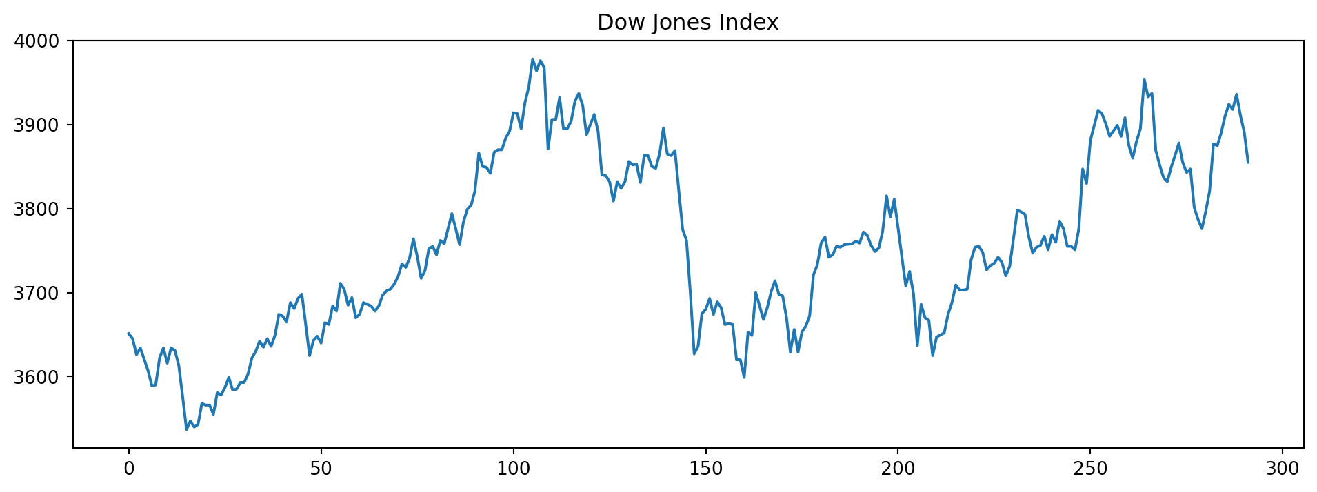
It is nonstationary because the mean (level) of the time series is not constant. However, the following differenced version of the same series is stationary. Take a look at Figure 6.11 to see the constant mean and variance depicted.
\[\begin{equation} \Delta y_t = y_t - y_{t-1} \end{equation}\]

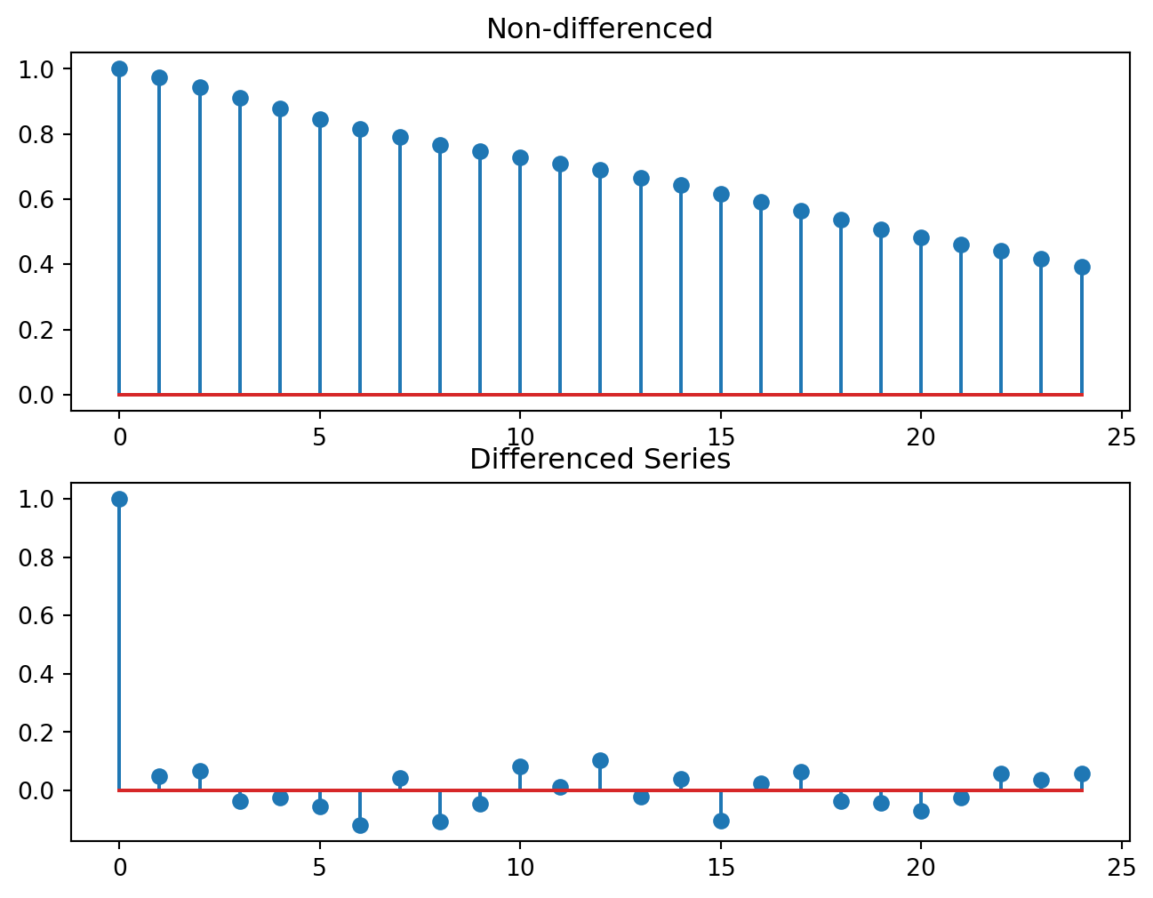
ARIMA models revolve around the idea that if we have a non-stationary series, we can transform it into a stationary one with a suitable number of differencing. A more general way of studying if a series is stationary is to plot it’s AutoCorrelation Function (ACF). The ARIMA method directly models the ACF. That is why it is so important for this class of models. The ACF of a stationary process should “die down” quickly. Figure 6.12 shows the ACF of the Dow Jones data, before and after differencing.
Now suppose that, starting from our original series \(y_t\), we difference it a sufficient number of times and obtain a stationary series. Let’s call this \(y'_t\). The ARIMA model assumes that
\[\begin{equation} y'_t = c + \phi_1 y'_{t-1} + \phi_2 y'_{t-2} + \cdots + \phi_p y'_{t-p} + \theta_1 e_{t-1} + \cdots + \theta_q e_{t-q} \end{equation}\]
- The \(e_j\) correspond to unobserved innovations. They are typically assumed to be independent across time with a common variance.
- The \(\phi\) and \(\theta\) terms are unknown coefficients to be estimated.
- If \(y'_t\) was obtained by performing \(d\) successive differencings, then the above ARIMA model is referred to as an \(\text{ARIMA}(p,d,q)\) model.
In olden days, the \(p\), \(d\) and \(q\) parameters were picked by the analyst after inspecting the ACF, PACF, and time plots of the differenced series. Today, we can iterate through a large number of them and pick the best according to a well-established criteria (AIC).
Example 6.11 (Auto ARIMA on Aus electricity)
Let us try out the ARIMA auto-fitting algorithm on the qau electricity usage dataset. We shall set aside the last three years of data as the test set. Recall that this is quarterly data. First, we establish the seasonal naive benchmark error for this dataset.
The RMSE is approximately 2.545.Let us see if the automatically fitted ARIMA models can do better than this.
Here is the summary of the final chosen model.
| Dep. Variable: | y | No. Observations: | 206 |
|---|---|---|---|
| Model: | SARIMAX(1, 1, 1)x(2, 0, [1, 2], 4) | Log Likelihood | -174.648 |
| Date: | Wed, 22 Jul 2026 | AIC | 365.295 |
| Time: | 09:57:10 | BIC | 391.880 |
| Sample: | 0 | HQIC | 376.048 |
| - 206 | |||
| Covariance Type: | opg |
| coef | std err | z | P>|z| | [0.025 | 0.975] | |
|---|---|---|---|---|---|---|
| intercept | 0.0021 | 0.003 | 0.678 | 0.498 | -0.004 | 0.008 |
| ar.L1 | 0.5539 | 0.078 | 7.100 | 0.000 | 0.401 | 0.707 |
| ma.L1 | -0.9001 | 0.050 | -18.115 | 0.000 | -0.998 | -0.803 |
| ar.S.L4 | 0.0880 | 0.230 | 0.382 | 0.702 | -0.364 | 0.540 |
| ar.S.L8 | 0.8868 | 0.227 | 3.905 | 0.000 | 0.442 | 1.332 |
| ma.S.L4 | 0.2908 | 0.221 | 1.317 | 0.188 | -0.142 | 0.724 |
| ma.S.L8 | -0.6146 | 0.125 | -4.903 | 0.000 | -0.860 | -0.369 |
| sigma2 | 0.2977 | 0.025 | 11.973 | 0.000 | 0.249 | 0.346 |
| Ljung-Box (L1) (Q): | 0.00 | Jarque-Bera (JB): | 20.82 |
|---|---|---|---|
| Prob(Q): | 0.95 | Prob(JB): | 0.00 |
| Heteroskedasticity (H): | 8.43 | Skew: | -0.09 |
| Prob(H) (two-sided): | 0.00 | Kurtosis: | 4.55 |
Warnings:
[1] Covariance matrix calculated using the outer product of gradients (complex-step).
The output indicates that a seasonal ARIMA model has been found to be the best one. The column coef contains estimates of the parameters in the model. The section below contains information on statistical tests
- for Normality on the residuals (Ljung-Box and Jarque-Bera), and
- for constant variance.
In addition to tests, we should always create plots to assess the validity of residuals.
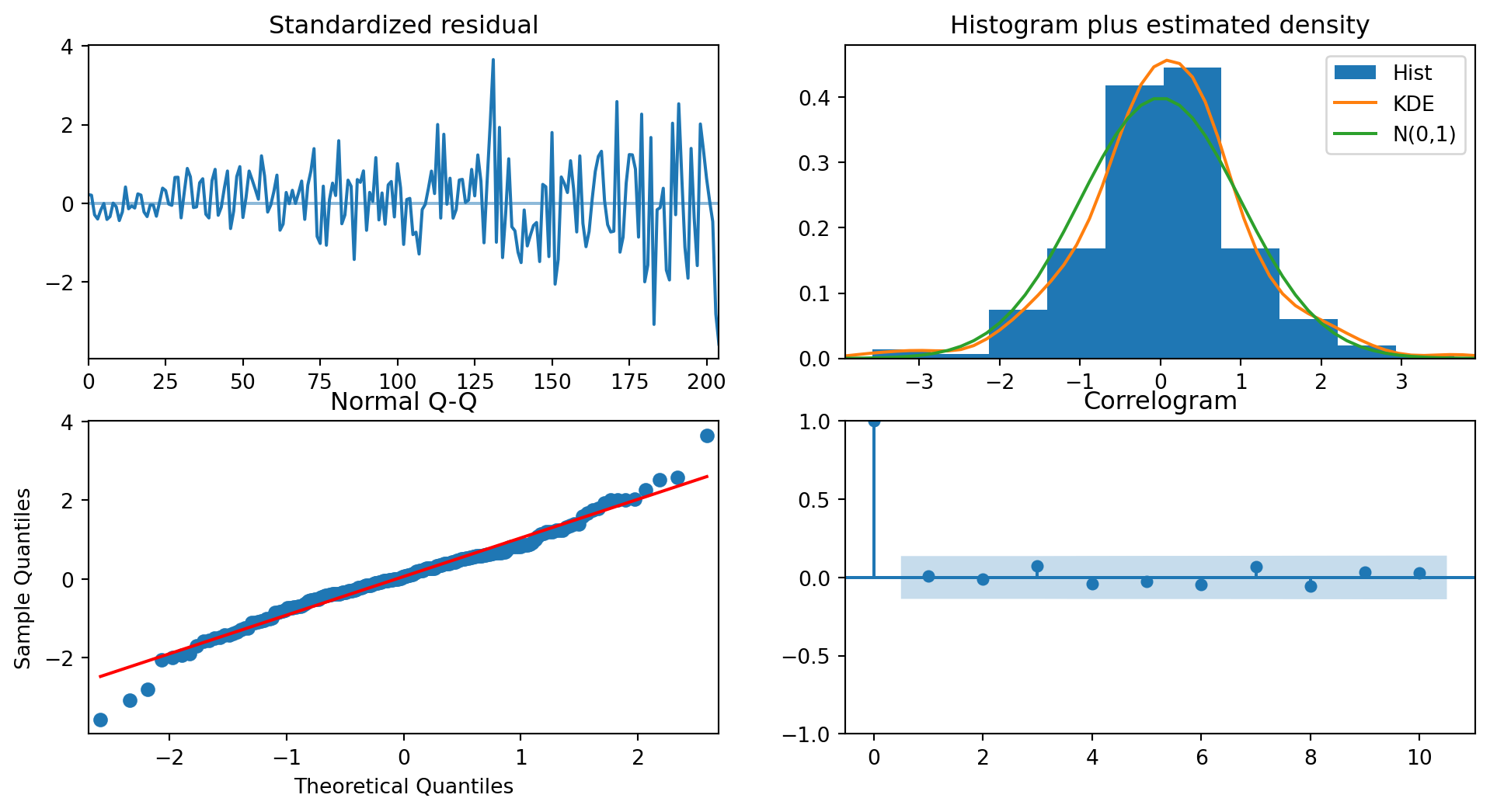
Once we have found the best-fitting model, we do what we do with any other model in data analytics: we have to inspect the residuals. The residuals should look like trash to us - there should be no clues about the data in them. With reference to Figure 6.13, the standardized residual in the top left should be consistently wide; it isn’t. In fact this information is also reflected in the model output summary (see Heteroskedasticity (H)). This suggests some sort of transformation of the data before modeling might be appropriate.
The two plots on the off-diagonal are meant for us to assess if the residuals are Normally distributed with mean 0. They do indeed look like it.
The final plot, in the bottom right, displays an ACF with no spikes, indicating that the residuals are uncorrelated. This is precisely what we wished to see.
Finally, we assess the error on the test set. The out-of-sample performance is better than the naive methods.
The RMSE on the test set is 1.972.
The MASE on the test set is 1.336.
Let us proceed to make a plot of the predictions (see Figure 6.14).
n_periods = 12
fc, confint = arima_m1.predict(n_periods=n_periods, return_conf_int=True)

ff = pd.Series(fc, index=test2.index)
lower_series = pd.Series(confint[:, 0], index=test2.index)
upper_series = pd.Series(confint[:, 1], index=test2.index)

plt.figure(figsize=(14, 5))
plt.plot(train2[-36:])
plt.plot(ff, color='red', label='Forecast')
plt.fill_between(lower_series.index, lower_series, upper_series, color='gray', alpha=.15)
plt.plot(test2, 'g--', label='True')
plt.legend();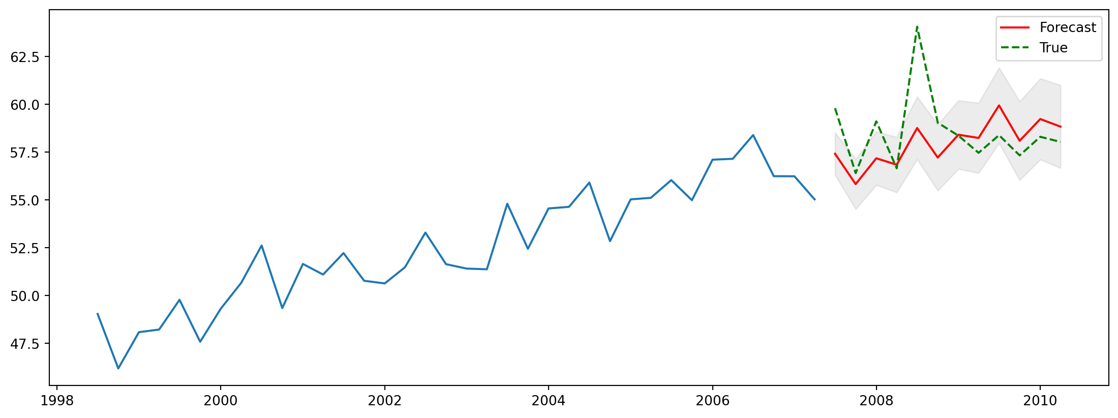
ETS
ETS models are a new class of models, that define a time series process according to a set of state space equations:
\[\begin{eqnarray} y_t &=& w' x_{t-1} + e_t \\ x_t &=& F x_{t-1} + g e_t \end{eqnarray}\]
The unobserved state \(x_t\) is usually a vector, and it typically contains information about
- the level of the process at time \(t\).
- the seasonal effect at time \(t\)
- the trend or growth factor at time \(t\).
All these parameters are updated at every point in time. For instance, the simplest ETS model (A,N,N), is one that assumes that there is only a level parameter, and that it is updated as a weighted average of the most recent levels:
\[\begin{eqnarray} l_t &=& \alpha y_t + (1- \alpha)l_{t-1} \\ \hat{y}_{t+1} &=& l_t \end{eqnarray}\]
The definition of the model is very flexible, and allows multiplicative growth, linear growth and damped terms in the model. All this, in addition to not requiring the assumption of stationarity!
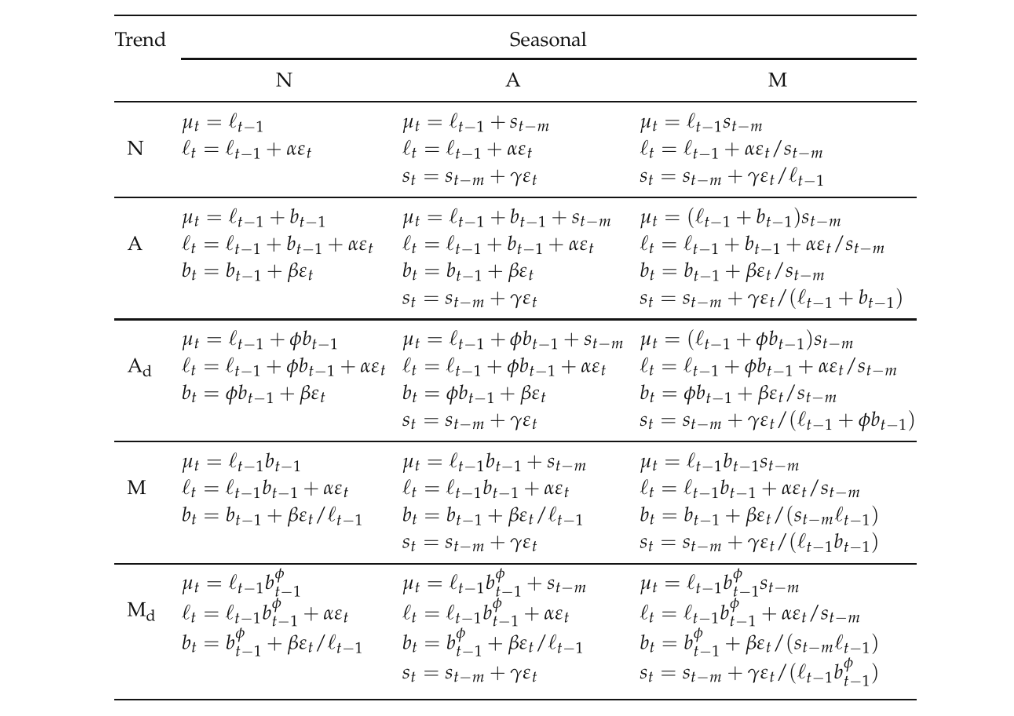
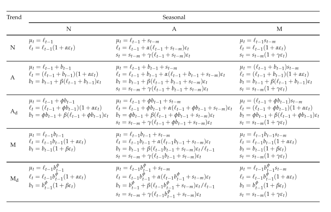
Figure 6.15 contains a full table of the additive models, while Figure 6.16 contains the multiplicative models. They were taken from Hyndman and Athanasopoulos (2018).
Example 6.12 (ETS model on Aus electricity dataset)
Let us try one of the basic models, with just a slope, level and seasonal effect ETS(A,A,A), on the qau dataset.
| Dep. Variable: | endog | No. Observations: | 206 |
|---|---|---|---|
| Model: | ExponentialSmoothing | SSE | 64.907 |
| Optimized: | True | AIC | -221.915 |
| Trend: | Additive | BIC | -195.292 |
| Seasonal: | Additive | AICC | -220.787 |
| Seasonal Periods: | 4 | Date: | Wed, 22 Jul 2026 |
| Box-Cox: | False | Time: | 09:57:11 |
| Box-Cox Coeff.: | None |
| coeff | code | optimized | |
|---|---|---|---|
| smoothing_level | 0.6206192 | alpha | True |
| smoothing_trend | 0.000000 | beta | True |
| smoothing_seasonal | 0.2690403 | gamma | True |
| initial_level | 4.0245534 | l.0 | True |
| initial_trend | 0.2509973 | b.0 | True |
| initial_seasons.0 | -0.3899476 | s.0 | True |
| initial_seasons.1 | 0.1112562 | s.1 | True |
| initial_seasons.2 | 0.2908031 | s.2 | True |
| initial_seasons.3 | -0.3718630 | s.3 | True |
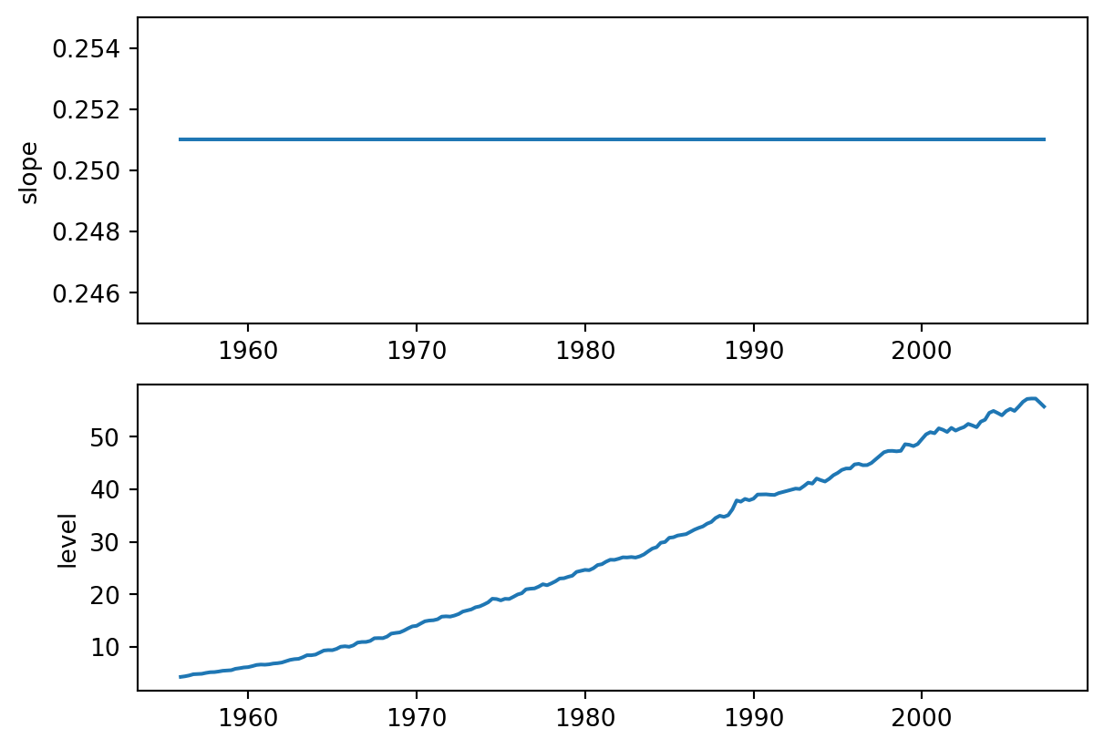
The plots in Figure 6.17 plot the estimated trend and level for the series. Notice how there is an almost constant slope for the series.
Finally, let’s take a look if the predictions on the test set are competitive with the automatic ARIMA model that was selected earlier. The forecasts are better than the naive ones, but not as good as the ARIMA. However, keep in mind that we are working with a single model - just as we did for ARIMA models, we should iterate over several ETS models and pick the best one in order to compare with the ARIMA model found.
Theta Method
The Theta method is a forecasting approach that has proved to be quite effective in competitions. It regularly appears as one of the best-performing models. Instead of decomposing a time series into Trend, Season and Remainder terms, the theta method decomposes a seasonally adjusted time series into short- and long-term components. The full reference for this method is Assimakopoulos and Nikolopoulos (2000).
Suppose we are interested in forecasting a time series \(\{y_t\}\). The theta decomposition is based on the concept of amplifying/diminishing the local curvatures of the time series. This is brought about through a coefficient \(\theta\); hence the name of the model.
As a preview, we are going to find series \(\{ x_{\theta,t}\}\) and \(\{ x_{1 - \theta,t}\}\) such that
\[ y_t = \frac{1}{2}(x_{\theta,t} + x_{1 - \theta,t}) \]
In order to forecast \(y_t\), we shall forecast \(\{ x_{\theta,t}\}\) and \(\{ x_{1 - \theta,t}\}\) separately and then combine them. There are numerous possible pairs of \(\{ x_{\theta,t}\}\) and \(\{ x_{1 - \theta,t}\}\) that we can use. However the most common one is where \(x_\theta\) corresponds to a straight line OLS fit, and \(x_{1 - \theta}\) corresponds to a version of the time series with its curvature amplified.
Example 6.13 (International tourism arrivals to Singapore)
The Singapore Department of Statistics shares information on tourist arrivals to Singapore at the monthly level. Figure 6.18 contains a time series plot of arrivals from South East Asian Countries:
tourism = pd.read_excel("data/international_visitor_arrivals_sg.xlsx",
                        parse_dates=[0], date_format="%Y %b",
                        na_values='na')
sea_tourism = tourism.iloc[:, 0:9]
sea_tourism.columns = ['Date', 'SEA', 'Brunei', 'Indonesia' ,'Malaysia',
                       'Myanmar', 'Philippines', 'Thailand', 'Vietnam']
sea_tourism.Date = sea_tourism.Date.str.replace('  ', '')
sea_tourism.Date = pd.to_datetime(sea_tourism.Date, format="%Y %b")
sea_tourism.set_index('Date', inplace=True)
sea_tourism.sort_index(inplace=True)
sea_tourism.index.freq = 'MS'

sea2 = sea_tourism.SEA[sea_tourism.index < datetime.datetime(2020, 1, 1)]
fig = sea2.plot(figsize=(12,4));
fig.set_title('Monthly Arrivals from SEA Countries before COVID-19');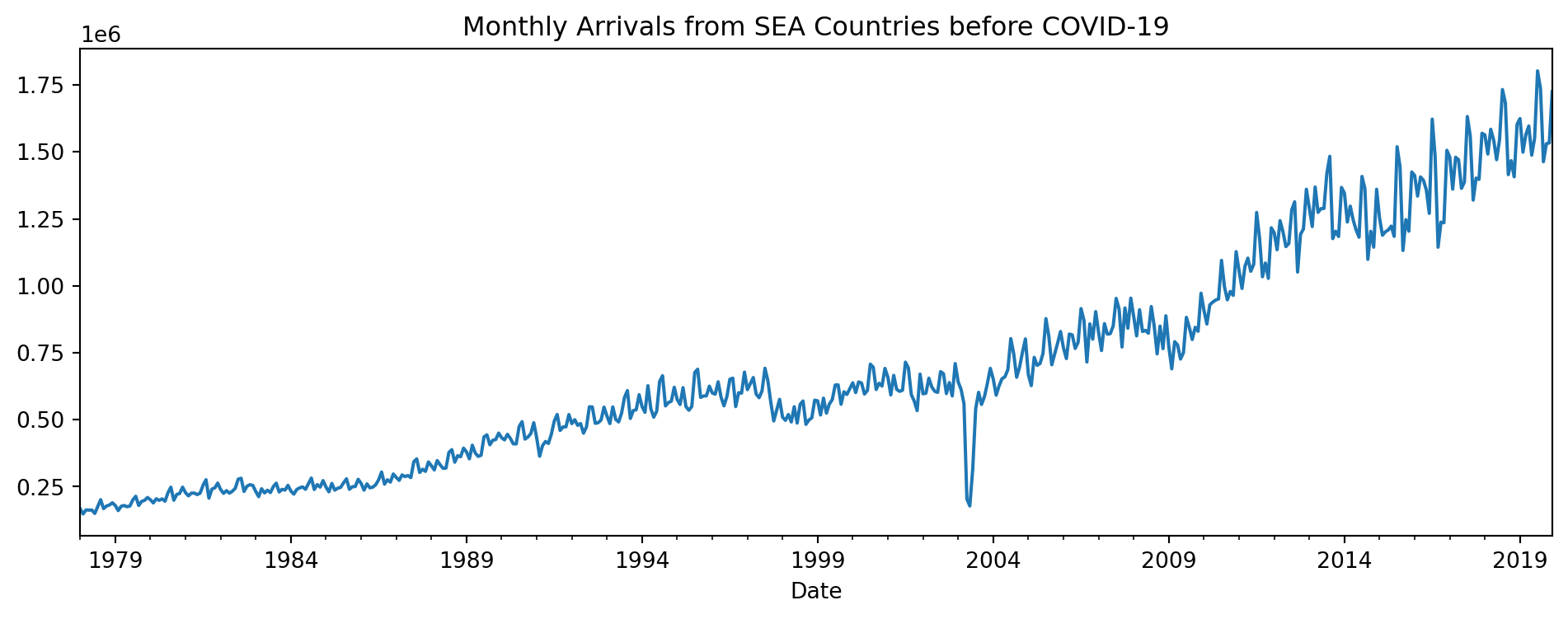
The data was obtained from the Department of Statistics. Take note that we are only going to focus on pre-COVID data.
To fit the theta model for this dataset, we use the following code:
                              ThetaModel Results
==============================================================================
Dep. Variable:                    SEA   No. Observations:                  504
Method:                       OLS/SES   Deseasonalized:                   True
Date:                Wed, 22 Jul 2026   Deseas. Method:         Multiplicative
Time:                        09:57:13   Period:                             12
Sample:                    01-01-1978
                         - 12-01-2019
  Parameter Estimates
========================
          Parameters
------------------------
b0    2628.8595906871597
alpha 0.8383848338839772
------------------------
Here is what the two components from the model look like, in comparison to the seasonally adjusted series (based on a multiplicative decomposition).
Note
The calculations in the next cell are based on formulas for the theta decomposition that we won’t get into. They are just for illustration of how the decomposition is in terms of long and short term trends, rather than the cross-sectional decompositions we have been dealing with so far. The orange dashed line in Figure 6.19 denotes the long-term trend that the model has identified, while the green dashed line denotes the short-term trend. The blue solid line is the seasonally adjusted time series.
# carry out mutliplicative decomposition in order to obtain seasonally adjusted series
sea2_mult = seasonal_decompose(sea2, model='multiplicative', extrapolate_trend='freq')

# get long-term trend slope and intercept
a0 = (sea2.mean() - theta_mod_fit.params['b0']*(503)/2)/1e6
xvals = np.arange(1, 505)
yvals1 = a0 + theta_mod_fit.params['b0']*(xvals - 1)
yvals1 = pd.Series(data=yvals1, index=sea2.index)

# get short term trend series
a2 = -1*a0
b2 = -1*theta_mod_fit.params['b0']
yvals2 = a2 + b2*(xvals - 1) + 2*(sea2_mult.resid + sea2_mult.trend)
yvals2 = pd.Series(data=yvals2, index=sea2.index)
fig = (sea2_mult.resid + sea2_mult.trend).plot(label='Seasonally adjusted',
                                               legend=True, figsize=(12,4));
yvals1.plot(legend=True, label='Long-term trend', style="--")
yvals2.plot(legend=True, label='Short-term trend', style="--");
fig.set_title("Theta decomposition");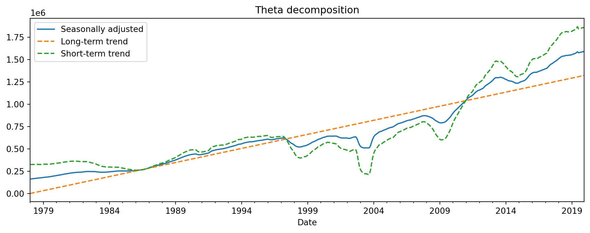
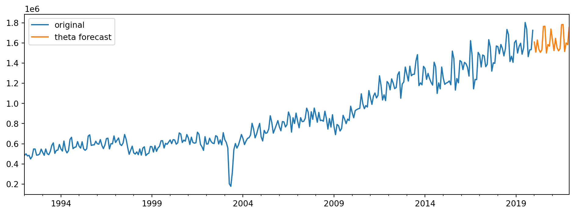
Finally, we visualise the forecasts from this theta decomposition model in Figure 6.20. We only plot the final 360 observations for the visualisation.
Forecasting with Seasonal Decomposition
Continuing with the tourism data, we demonstrate how we can utilise a seasonal decomposition (not theta decomposition) model to make forecasts. Recall that a seasonal decomposition breaks the series down into the trend, seasonal and residual components. Seasonal decompositions are typically used to study a time series, but they can also be used to make forecasts. One approach is to use either ARIMA or ETS to predict the seasonally adjusted component, and then to use a seasonal naive model to predict the seasonal component. These two forecasts will then be combined to create the final forecast.
Example 6.14 (Tourism forecasts with decomposition)
Here is the code that will use and STL model to decompose the series, and fit a pre-chosen ARIMA(3,1,2) model to the seasonally adjusted series. The output forecasts can be seen in Figure 6.21.
C:\Users\stavg\Documents\courses\ind5003-book\env\Lib\site-packages\statsmodels\tsa\statespace\sarimax.py:966: UserWarning: Non-stationary starting autoregressive parameters found. Using zeros as starting parameters.
  warn('Non-stationary starting autoregressive parameters'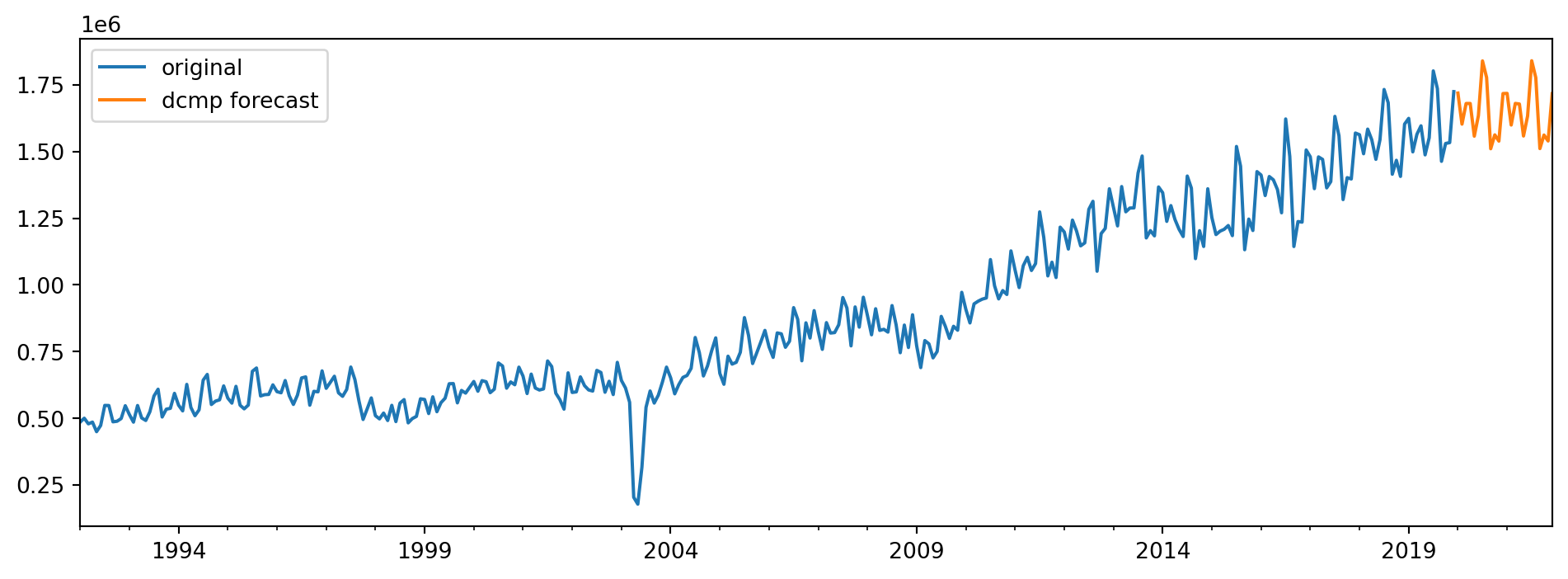
6.4 Miscellaneous Topics
Time Series Clustering
Example 6.15 (Time series clustering, US employment data)
The Forecasting: Principles and Practice contains time series data on employment in various sectors in the US. There are 148 unique series in the dataset.
| Month | Series_ID | Title | Employed | |
|---|---|---|---|---|
| 116139 | 2008-01-01 | CEU6562200001 | Education and Health Services: Hospitals | 4564.8 |
| 96588 | 1993-10-01 | CEU6054110001 | Professional and Business Services: Legal Serv... | 964.1 |
| 117156 | 2012-01-01 | CEU6562300001 | Education and Health Services: Nursing and Res... | 3167.4 |
| 124962 | 2016-07-01 | CEU7071300001 | Leisure and Hospitality: Amusements, Gambling,... | 1936.2 |
| 74593 | 2018-02-01 | CEU4349300001 | Transportation and Warehousing: Warehousing an... | 1099.2 |
| 61917 | 2011-07-01 | CEU4245210001 | Retail Trade: Department Stores (DISCONTINUED) | 1516.5 |
| 143199 | 2002-01-01 | TEMPHELPN | All Employees, Temporary Help Services | 2011.4 |
| 116348 | 1944-09-01 | CEU6562300001 | Education and Health Services: Nursing and Res... | NaN |
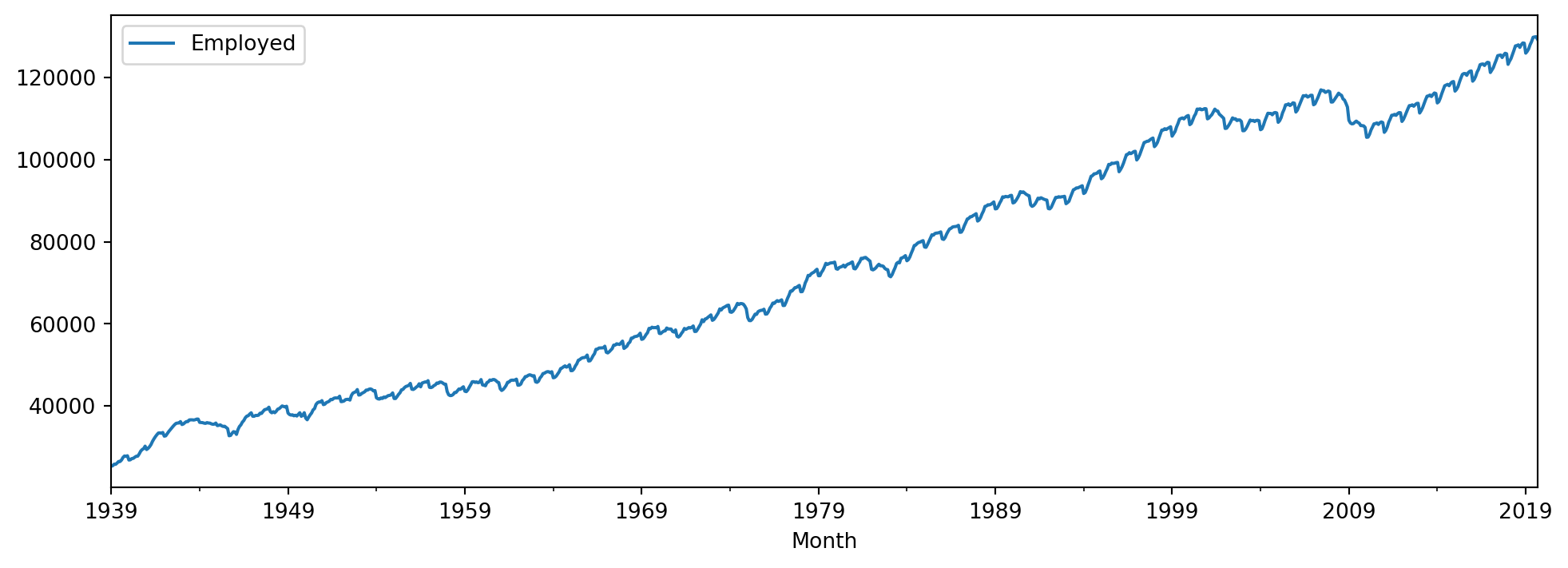
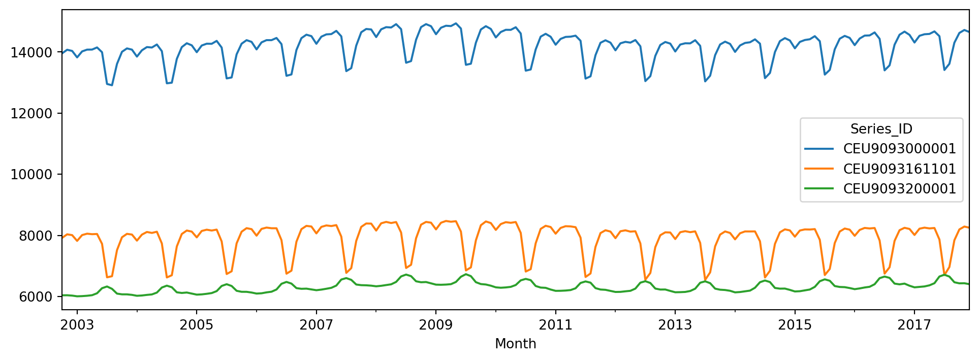
Figure 6.22 contains a time series plot of one of the time series in the dataset.
Since we are going to perform clustering on the time series data, our first step is to remove the missing values.
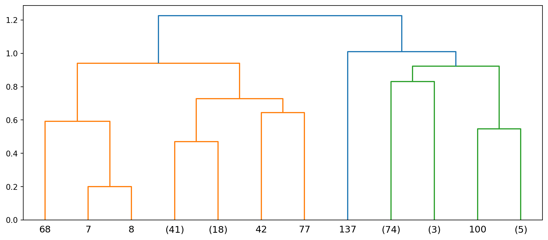
Now we can begin the clustering procedure. The first line in the code below generates a 148 x 148 distance matrix. For more details on hierarchical clustering, refer to Section 3.3. The resulting dendrogram can be seen in Figure 6.23.
We reorder the columns and rows in the matrix so that similar time series appear next to one another (see Figure 6.24).
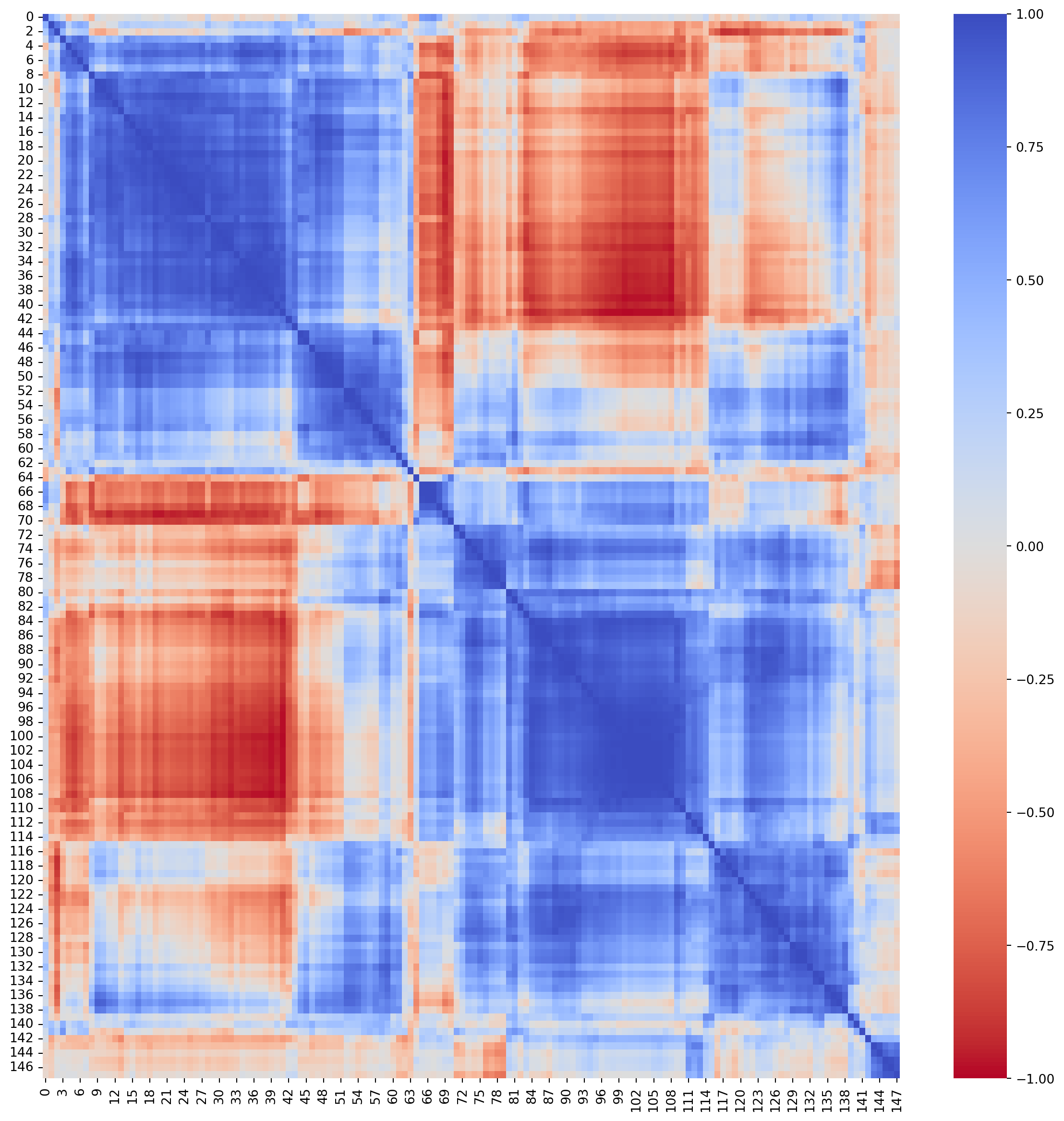
In the next few plots, we use the heatmap in Figure 6.24 to pick out series that are close to one another. Series in blue segments of the matrix are highly correlated; here we inspect them to try to characterise the similarity.
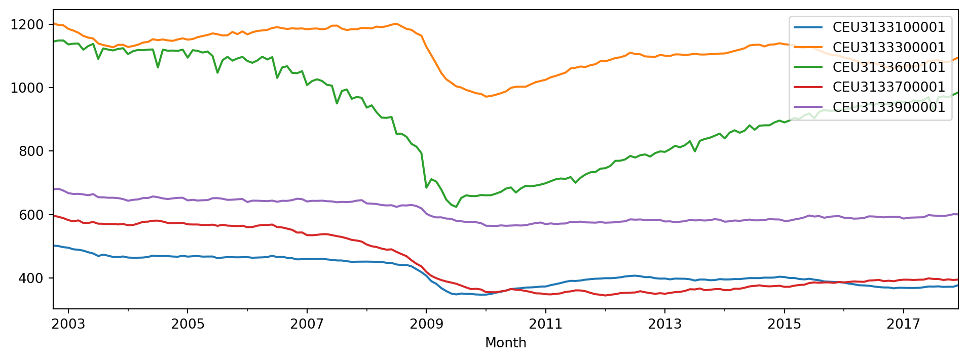
The series in Figure 6.25 seem to have a dip around the period 2009 - 2011, while those in Figure 6.26 have a cyclical pattern.
6.5 Summary
We have briefly covered the following time series concepts: Exploratory data analysis, assessing point forecasts and a few commonly used models. To finish up the section, we also applied clustering to time series. With today’s code, the model-fitting routines are easier to run. As always, the onus is on us as analysts to inspect the residuals from the models to understand the time series we are working with.
6.6 References
Stats models pages
Forecasting principles and practice
Although the code for this textboook uses R, the concepts are very well explained. It is written by one of the foremost experts in time series forecasting methods. The reference is Hyndman and Athanasopoulos (2018).
6.7 Exercises
- Create a lag plot, with 8 lags, of the Australian electricity data in
qauselec.csv. - Extract the residuals from applying the seasonal naive model to the Australian electricity data, and compare the residual plots to the ones in Figure 6.13.
- Apply the auto ARIMA procedure to the housing sales data, and inspect the residuals.
- Apply the ETS (M,A,A) model to the Australian electricity data. Compare the RMSE and residuals to the ETS model fitted in Example 6.12.
- Apply the auto ARIMA procedure directly to the tourism data, and compare it to the theta model and the seasonal decomposition one in Example 6.14.